Show/Hide Code
# 环境准备
library(tidyverse) # tidyverse
library(hrbrthemes) # 主题
library(patchwork) # 组合图形
library(geomtextpath) # 添加文本路径
library(ggiraph) # 交互式图形
library(sf) # 地理数据处理
library(qqman) # 曼哈顿图
library(knitr)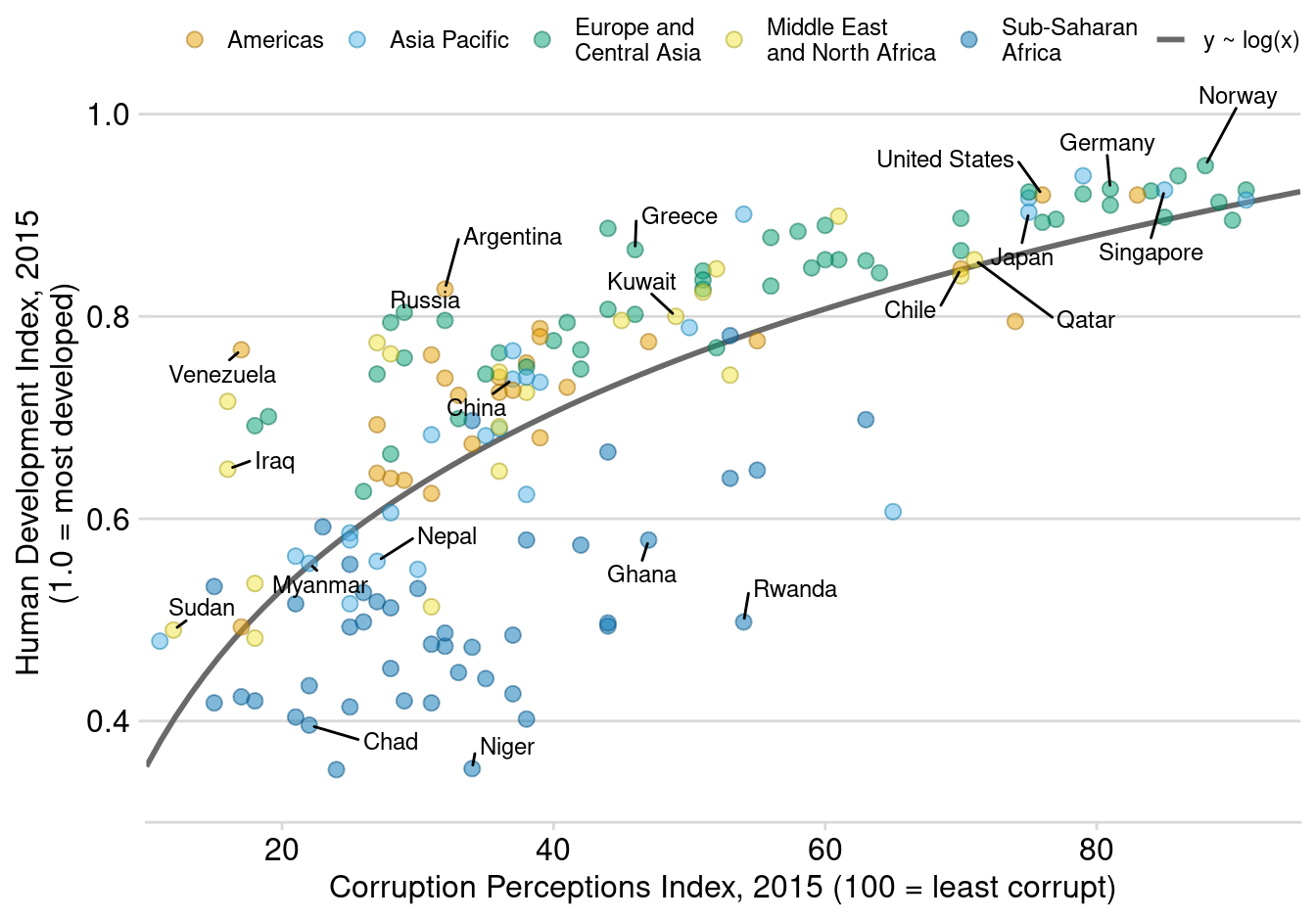
set.seed(123)散点图显示两个数值变量之间的关系。每个点代表一个观测值。
# 环境准备
library(tidyverse) # tidyverse
library(hrbrthemes) # 主题
library(patchwork) # 组合图形
library(geomtextpath) # 添加文本路径
library(ggiraph) # 交互式图形
library(sf) # 地理数据处理
library(qqman) # 曼哈顿图
library(knitr)
set.seed(123)ggplot(iris, aes(x=Sepal.Length, y=Sepal.Width)) +
geom_point()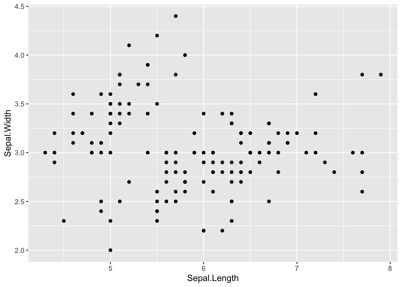
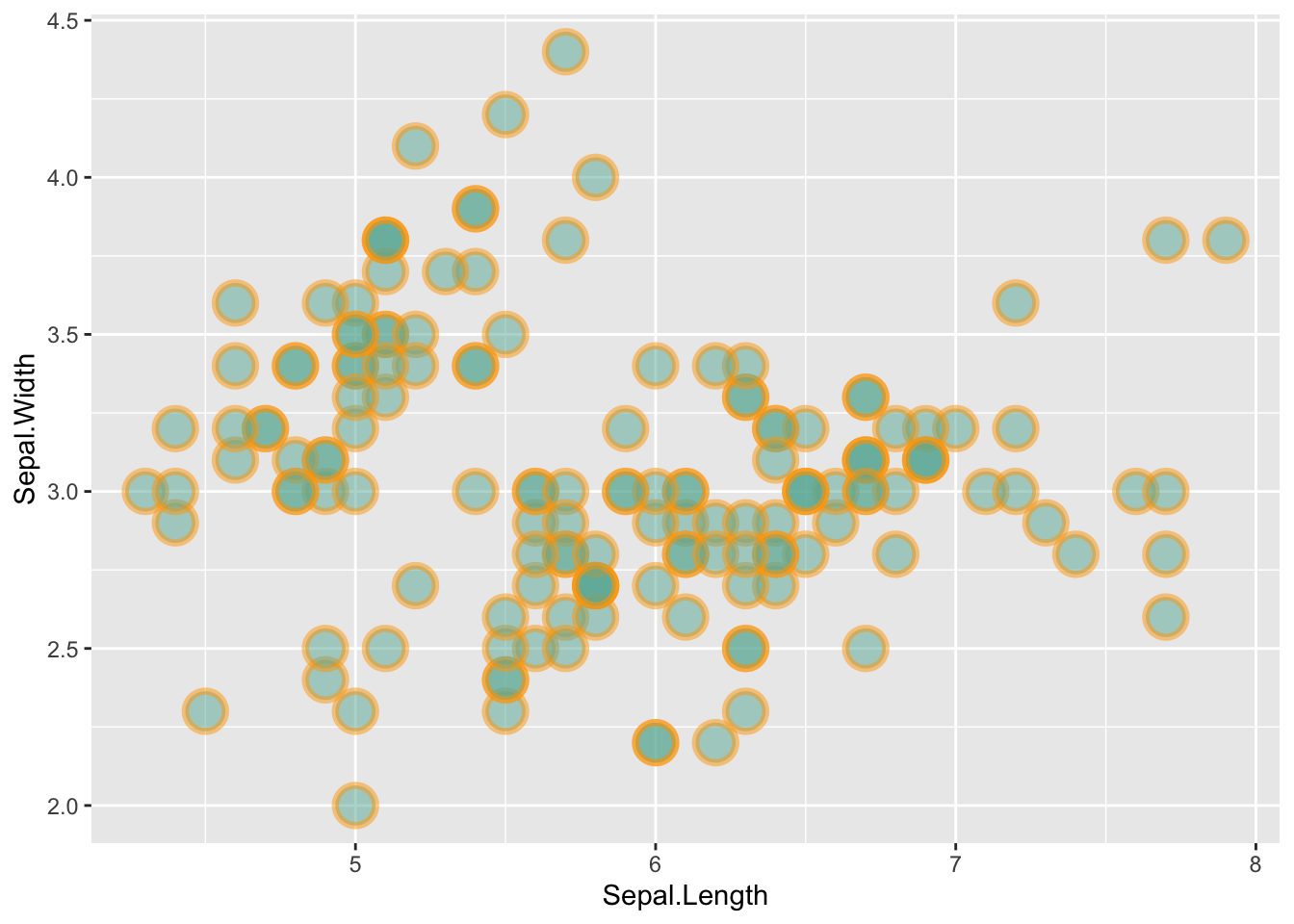
ggplot(iris, aes(x=Sepal.Length, y=Sepal.Width)) +
    geom_point(
        color="orange",
        fill="#69b3a2",
        shape=21,
        alpha=0.5,
        size=6,
        stroke = 2
        )
ggplot(iris, aes(x = Sepal.Length, y = Sepal.Width)) +
    geom_point(
        color = "black",
        fill = "#69b3a2",
        shape = 22,
        alpha = 0.5,
        size = 6,
        stroke = 1
    ) +
theme_ipsum() 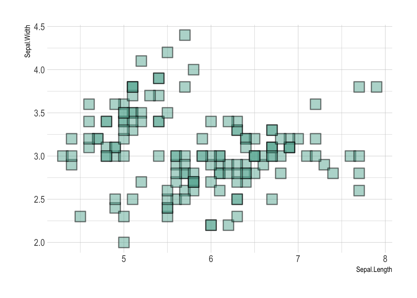
# 改可以同时添加多个变量到aes()中,比如shape+color,但是比较乱

# color
p_color <- ggplot(iris, aes(x=Sepal.Length, y=Sepal.Width, color=Species)) +
    geom_point() +
    theme(legend.position = "bottom")

# alpha 不推荐把离散变量Species添加到alpha
p_alpha <- ggplot(iris, aes(x=Sepal.Length, y=Sepal.Width, alpha=Species)) +
    geom_point() +
    theme(legend.position = "bottom")


# Shape
p_shape <- ggplot(iris, aes(x=Sepal.Length, y=Sepal.Width, shape=Species)) +
    geom_point() +
    theme(legend.position = "bottom")

# Size 不推荐把离散变量Species添加到size
p_size <- ggplot(iris, aes(x=Sepal.Length, y=Sepal.Width, size=Species)) +
    geom_point() +
    theme(legend.position = "bottom")

(p_color + p_alpha) / (p_shape + p_size)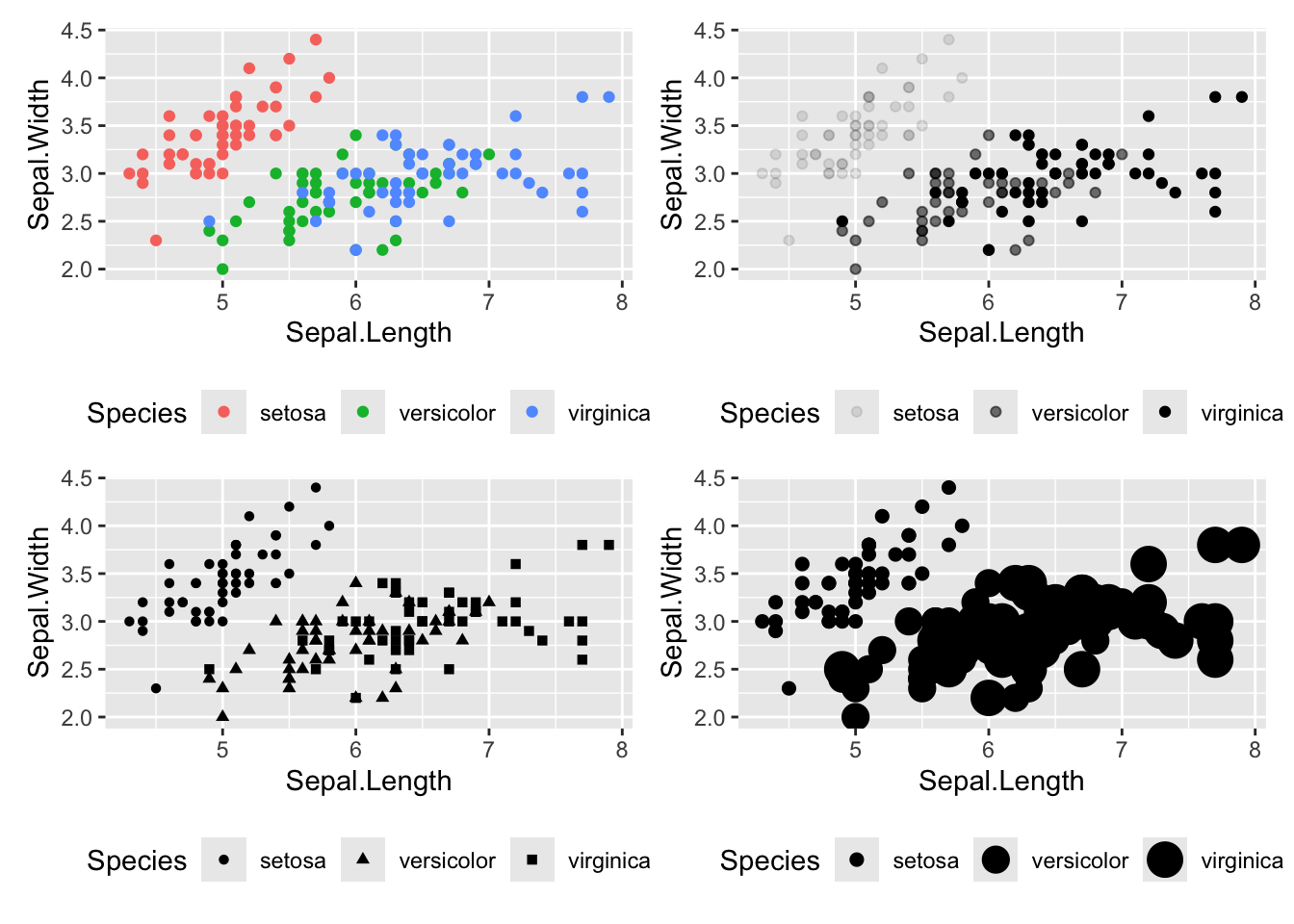
在X轴和Y轴上添加geom_rug图,可以显示数据的分布情况。
ggplot(iris, aes(x=Sepal.Length, Petal.Length)) +
  geom_point() +
  geom_rug(color="steelblue",alpha=0.1, size=1.5)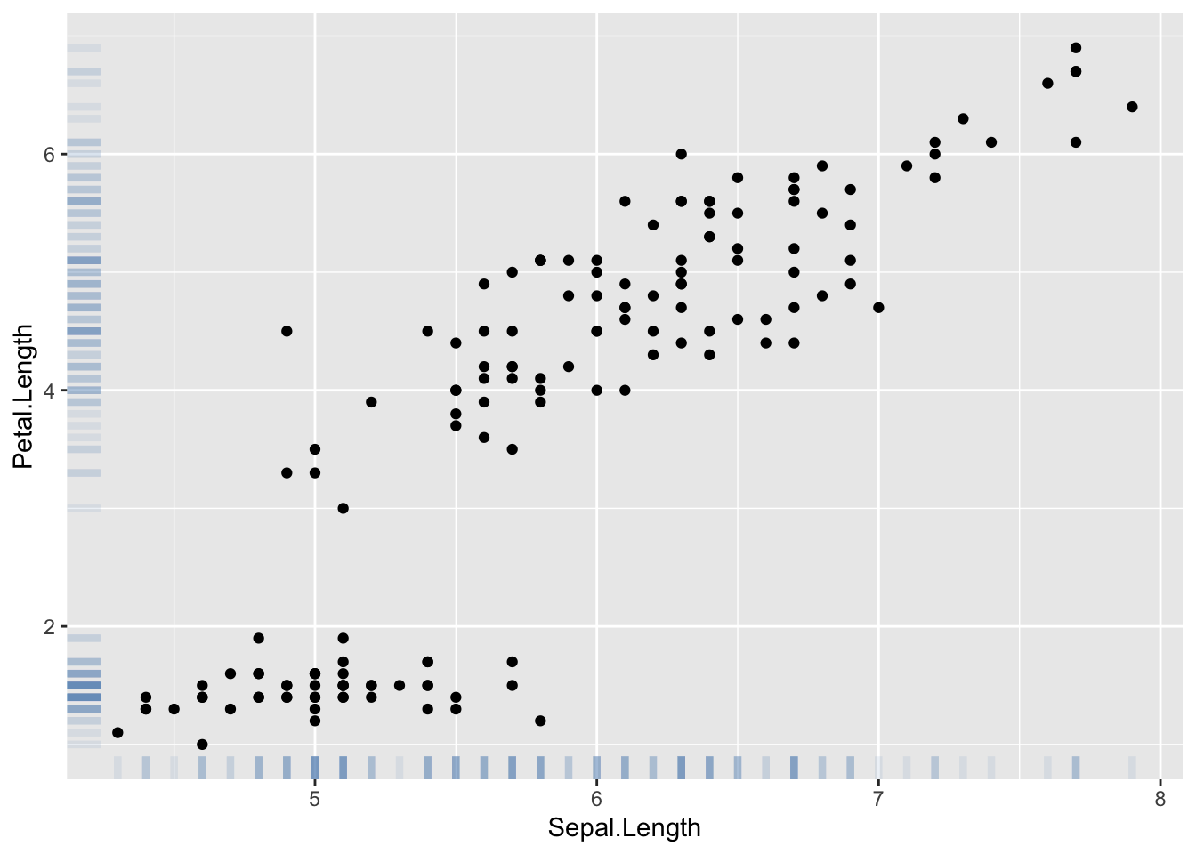
# 基础散点图
p1 <- ggplot(iris, aes(x=Sepal.Length, y=Sepal.Width)) +
  geom_point( color="#69b3a2")

# 添加线性趋势
p2 <- ggplot(iris, aes(x=Sepal.Length, y=Sepal.Width)) +
  geom_point() +
  geom_smooth(method=lm , color="red", se=FALSE)

# 添加线和阴影
p3 <- ggplot(iris, aes(x=Sepal.Length, y=Sepal.Width)) +
  geom_point() +
  geom_smooth(method=lm , color="red", fill="#69b3a2", se=TRUE)

p1 / p2 / p3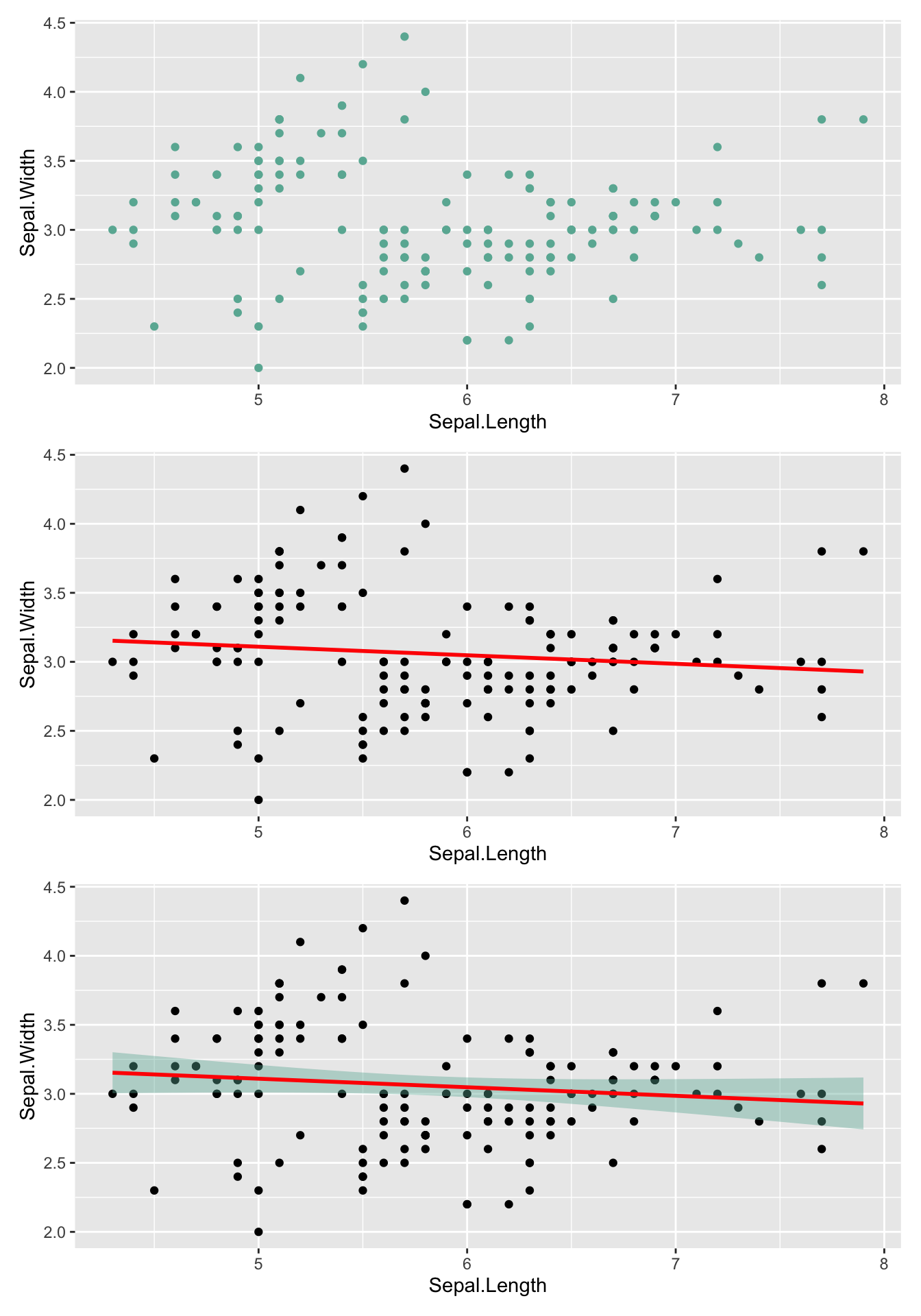
geom_labelsmooth() 创建带有lable的线
library(hrbrthemes)
library(patchwork)
library(geomtextpath)

# 一个拟合线

p1 <- ggplot(iris, aes(x = Sepal.Length, y = Sepal.Width)) +
  geom_point() +
  geom_labelsmooth(
    aes(label = 'My Label'),
    fill = "white",
    method = "lm",
    formula = y ~ x,
    size = 6,
    linewidth = 2,
    boxlinewidth = 0.6
  )

# 多个拟合线
p2 <- ggplot(iris, aes(x = Sepal.Length, y = Petal.Length, color = Species)) +
  geom_point() +
  geom_labelsmooth(
    aes(label = Species),
    fill = "white",
    method = "lm",
    formula = y ~ x,
    size = 3,
    linewidth = 1,
    boxlinewidth = 0.4
  ) +
  guides(color = 'none')

p1 + p2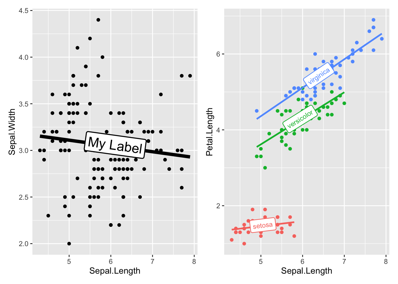
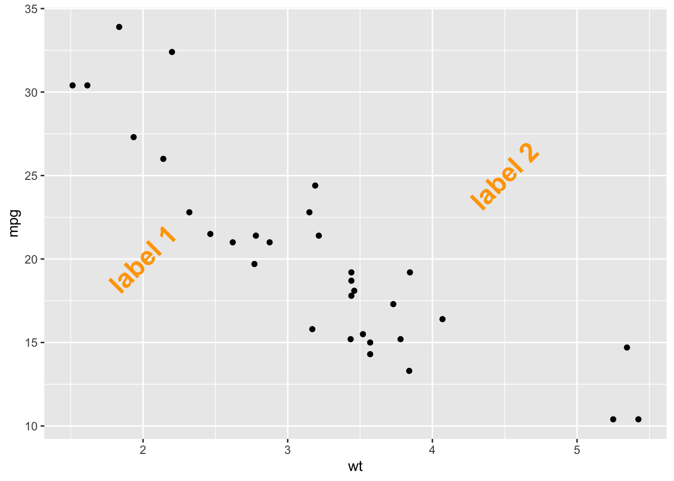
在图上添加标注,可以突出重点信息, 参考WHY ANNOTATING?
添加文本标注的几种方式:geom_text()、geom_label()、annotate()。geom_text() 和 annotate() 写法不同,效果相同,geom_label() 有背景色。annotate() 是更全能的标注方式
p <- ggplot(mtcars, aes(x = wt, y = mpg)) +
    geom_point()

# 注释的坐标和内容
annotation <- data.frame(
    x = c(2, 4.5),
    y = c(20, 25),
    label = c("label 1", "label 2")
)

# 使用 annotate() 添加标注
# p +
#     annotate(
#         "text",
#         x = c(2, 4.5),
#         y = c(20, 25),
#         label = c("label 1", "label 2"),
#         color = "orange",
#         size = 7,
#         angle = 45,
#         fontface = "bold"
#     )

# 使用 geom_text() 添加标注
p +
    geom_text( # 或者使用 geom_label
        data = annotation,
        aes(x = x, y = y, label = label),
        color = "orange",
        size = 7,
        angle = 45,
        fontface = "bold"
    )
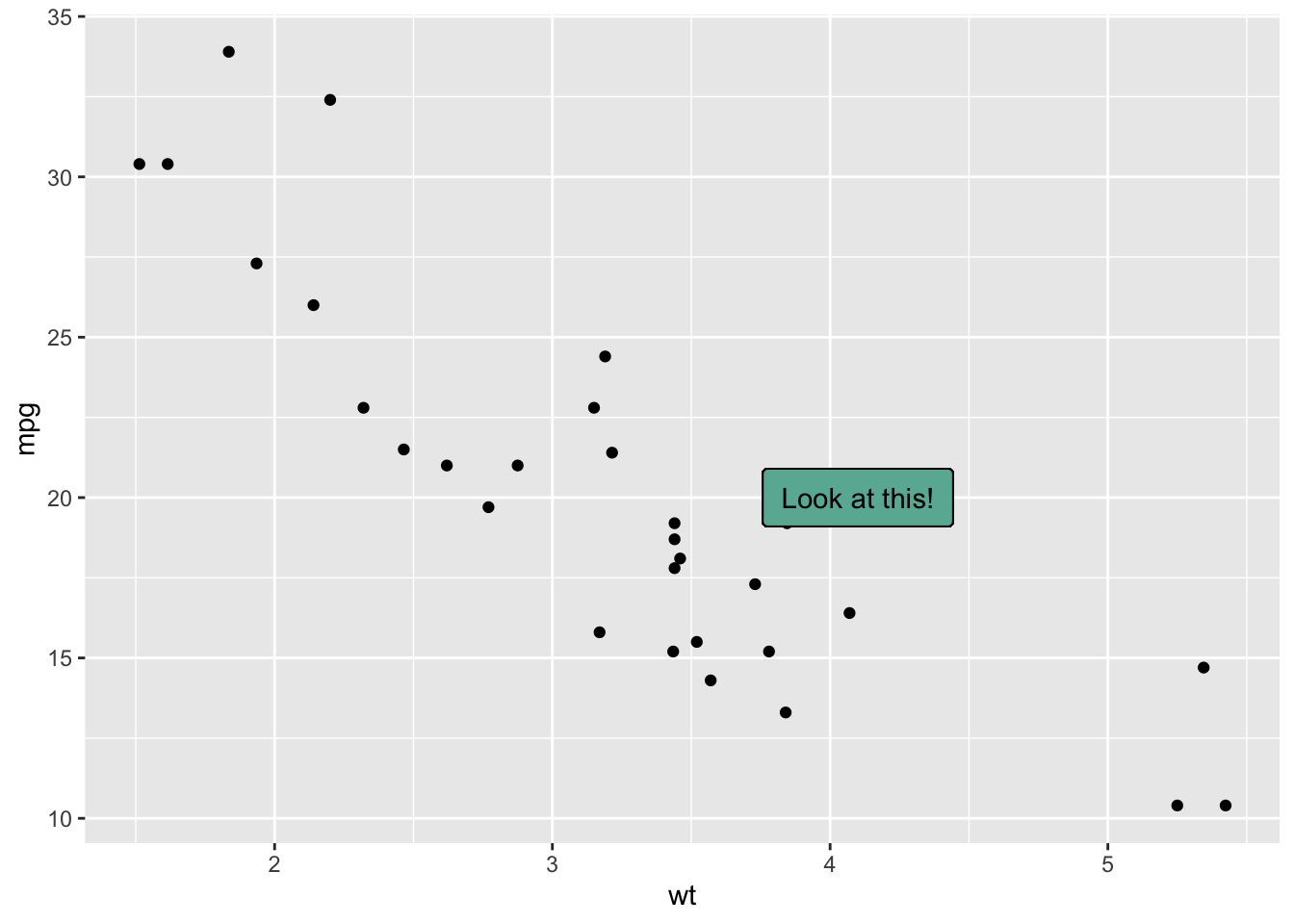
data = head(mtcars, 30)

ggplot(data, aes(x = wt, y = mpg)) +
    geom_point() + # Show dots
    geom_label(
        label = "Look at this!",
        x = 4.1,
        y = 20,
        label.padding = unit(0.55, "lines"), # Rectangle size around label
        label.size = 0.35,
        color = "black",
        fill = "#69b3a2"
    )
data <- head(iris, 20)

ggplot(data, aes(x = Sepal.Length, y = Sepal.Width)) +
    geom_point() +
    geom_label( # 与ggplot2语法相似
        data = data |> filter(Sepal.Length>5 & Sepal.Width>2),
        aes(label = Species)
    )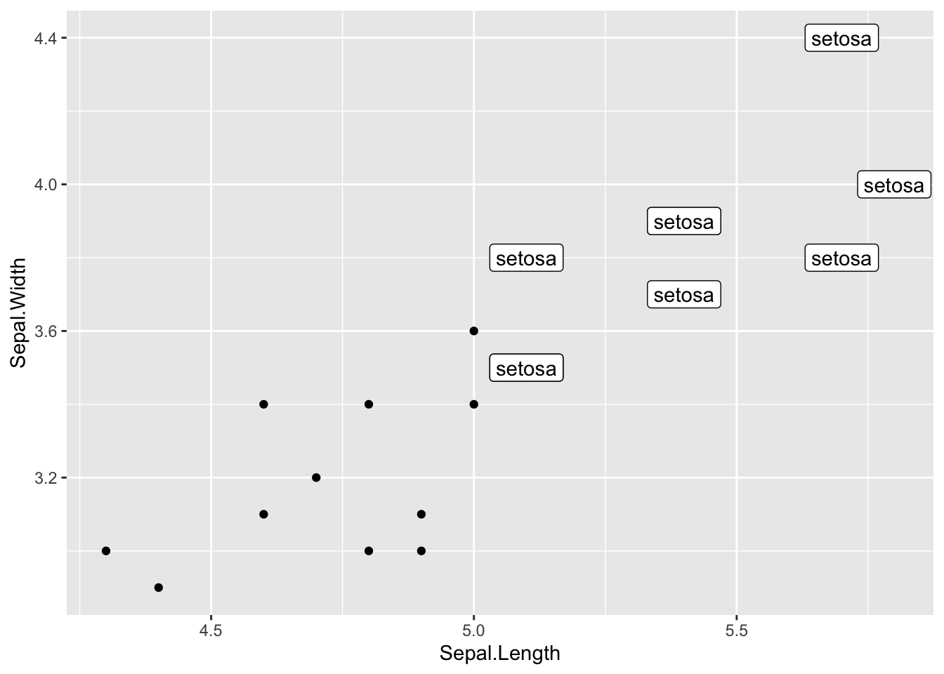
# 区别是 geom_label() 有背景色, 没有check_overlap参数

data = head(mtcars, 30)

p <- ggplot(data, aes(x=wt, y=mpg)) +
  geom_point()

# 使用 geom_text() 添加标签
p_text <- p +
    geom_text(
        label = rownames(data), # 或者 data$<列名>
        nudge_x = 0.25, # 调整标签x位置
        nudge_y = 0.25, # 调整标签y位置
        check_overlap = T # 避免标签重叠,重叠只会留一个
    )

p_label <- p +
    geom_label(
        label = rownames(data), # 或者 data$<列名>
        nudge_x = 0.25, # 调整标签x位置
        nudge_y = 0.25, # 调整标签y位置
    )

p_text + p_label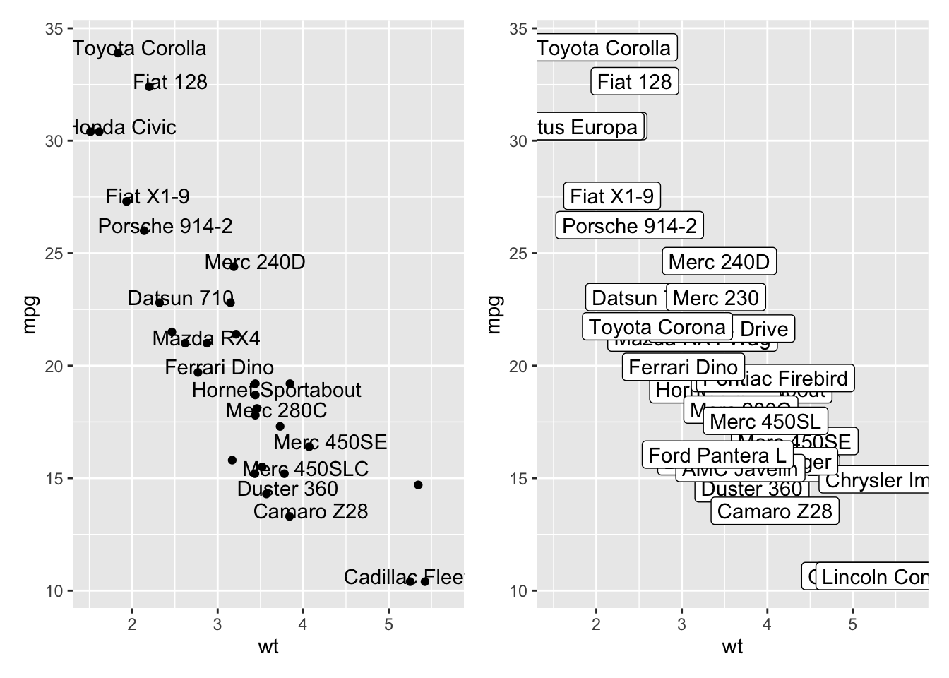
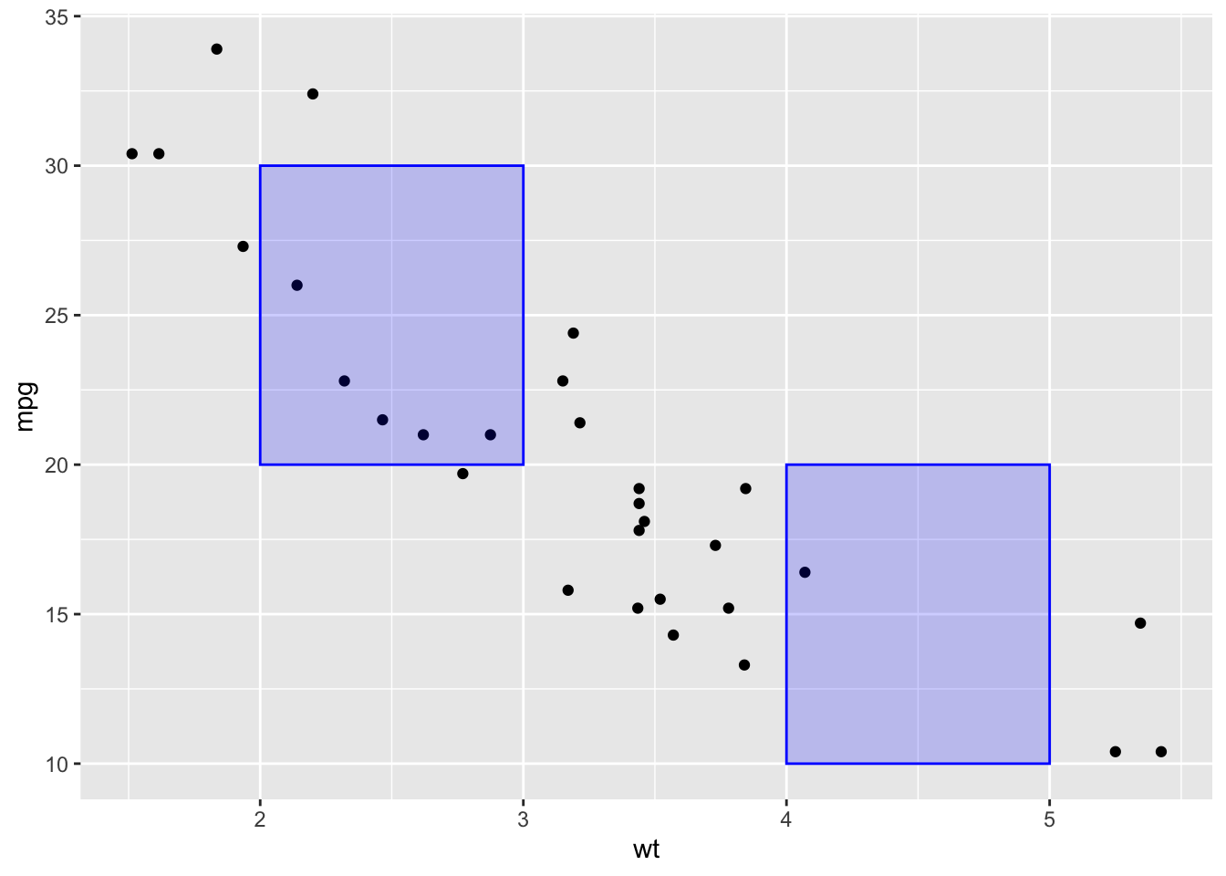
# rect 矩形
p +
    annotate(
        "rect",
        xmin = c(2, 4),
        xmax = c(3, 5),
        ymin = c(20, 10),
        ymax = c(30, 20),
        alpha = 0.2,
        color = "blue",
        fill = "blue"
    )
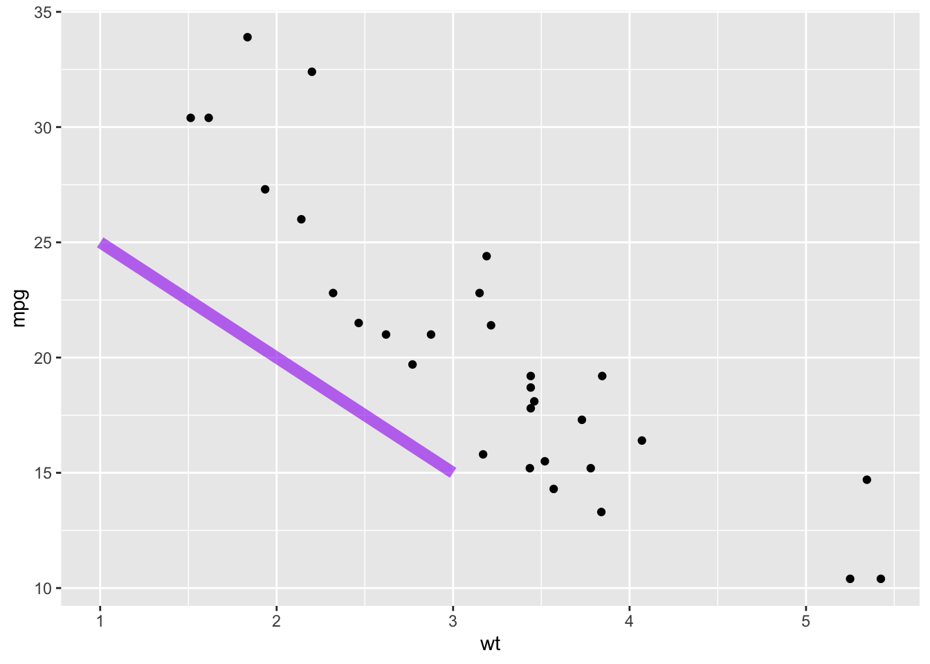
#  线段
p +
    annotate(
        "segment",
        x = 1,
        xend = 3,
        y = 25,
        yend = 15,
        colour = "purple",
        size = 3,
        alpha = 0.6
    )
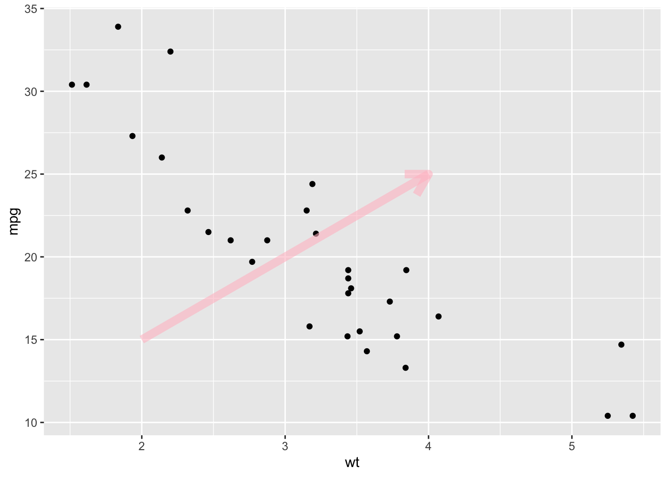
# segment + arrow 箭头
p +
    annotate(
        "segment",
        x = 2,
        xend = 4,
        y = 15,
        yend = 25,
        colour = "pink",
        size = 3,
        alpha = 0.6,
        arrow = arrow()
    )
p +
  # 水平线
  geom_hline(yintercept=25, color="orange", size=1) +
  # 垂直线
  geom_vline(xintercept=3, color="orange", size=1)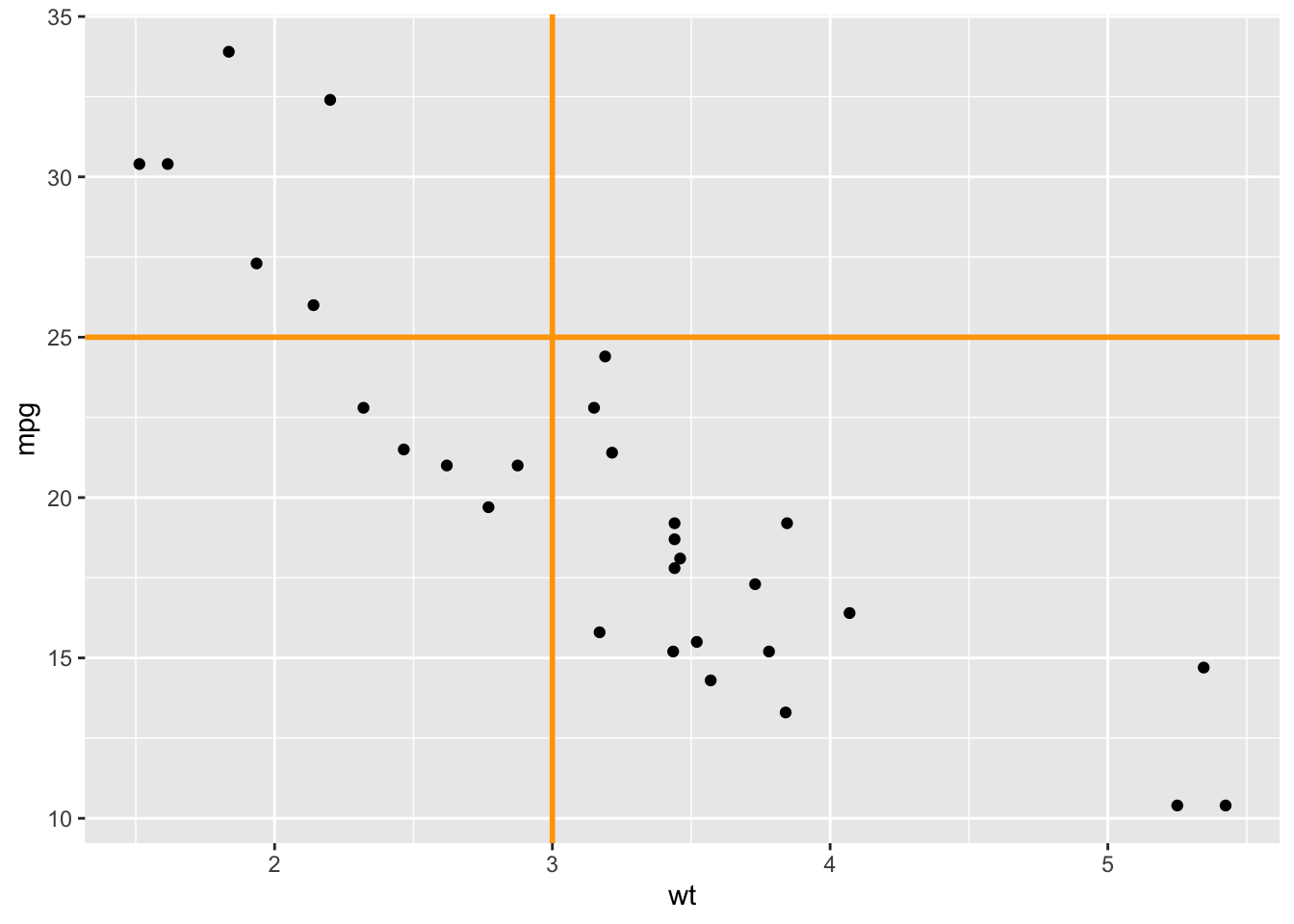
# 好像不知道这个到底有啥用
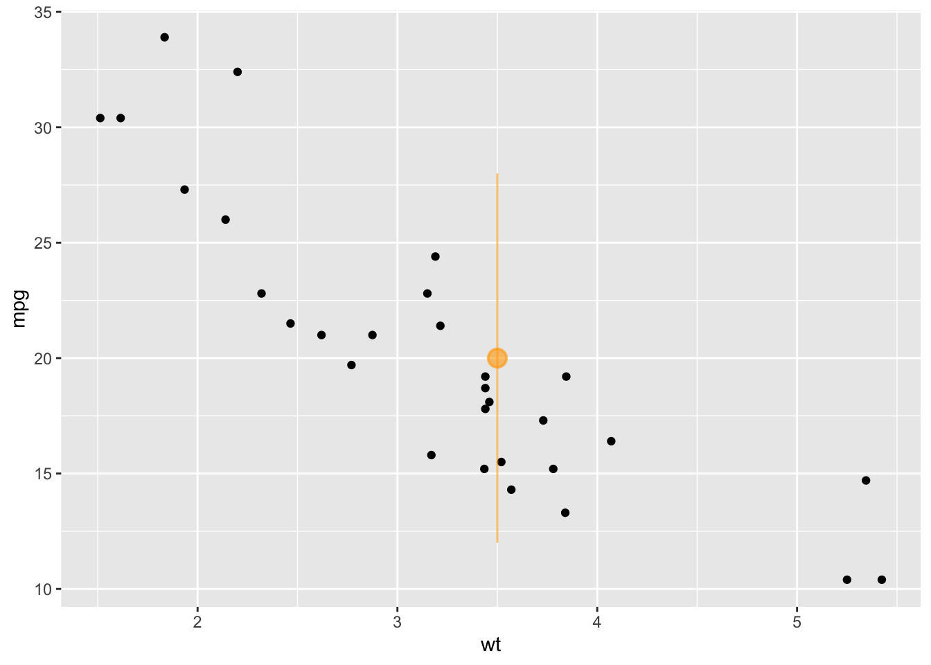
p +
annotate(
"pointrange",
x = 3.5,
y = 20,
ymin = 12,
ymax = 28,
colour = "orange",
size = 1,
alpha = 0.6
)
见 R-graph-gallery 的 scatterplot
# 将mtcars数据集的行名(汽车型号)保存到一个名为'car'的新列中,方便后续调用。
mtcars$car <- rownames(mtcars)

# p1: 创建一个可交互的散点图。
# x轴是车重(wt),y轴是燃油效率(mpg)。
# 鼠标悬停在点上时,会显示汽车型号(tooltip = car)。
p1 <- ggplot(mtcars, aes(wt, mpg, tooltip = car, data_id = car)) +
  geom_point_interactive(size = 4)

# p2: 创建一个可交互的水平条形图。
# x轴是汽车型号,并按燃油效率(mpg)从低到高排序 (reorder(car, mpg))。
# y轴是燃油效率(mpg)。
# coord_flip()将图表翻转为水平方向,便于阅读。
p2 <- ggplot(mtcars, aes(x = reorder(car, mpg), y = mpg, tooltip = car, data_id = car)) +
  geom_col_interactive() +
  coord_flip()

# 使用patchwork包的 `+` 号,将散点图(p1)和条形图(p2)并排拼接成一张图。
combined_plot <- p1 + p2 + plot_layout(ncol = 2)

# 使用ggiraph包的girafe()函数,将拼接好的静态图转换为最终的HTML交互式图表。
girafe(ggobj = combined_plot)
交互式散点图
# 从网络读取世界地图的地理空间数据 (.geojson格式)
world_sf <- read_sf("https://raw.githubusercontent.com/holtzy/R-graph-gallery/master/DATA/world.geojson")

# 从地图数据中移除南极洲和格陵兰,因为它们通常很大且没有数据,会影响可视化。
world_sf <- world_sf %>%
  filter(!name %in% c("Antarctica", "Greenland"))

# 创建一个包含幸福度指数等指标的示例数据集。
happiness_data <- data.frame(
  Country = c("France", "Germany", "United Kingdom", "Japan", "China", "Vietnam", "United States of America", "Canada", "Mexico"),
  Continent = c("Europe", "Europe", "Europe", "Asia", "Asia", "Asia", "North America", "North America", "North America"),
  Happiness_Score = rnorm(mean = 30, sd = 20, n = 9),
  GDP_per_capita = rnorm(mean = 30, sd = 20, n = 9),
  Social_support = rnorm(mean = 30, sd = 20, n = 9),
  Healthy_life_expectancy = rnorm(mean = 30, sd = 20, n = 9)
)

# 使用左连接(left_join)将幸福度数据合并到世界地图数据中。
# 连接的依据是国家名称 (地图中的 'name' 和 幸福度数据中的 'Country')。
world_sf <- world_sf %>%
  left_join(happiness_data, by = c("name" = "Country"))

# p1: 创建散点图,展示人均GDP与幸福度指数的关系。
p1 <- ggplot(world_sf, aes(GDP_per_capita, Happiness_Score, tooltip = name, data_id = name, color = name)) +
  geom_point_interactive(data = filter(world_sf, !is.na(Happiness_Score)), size = 4) +
  theme_minimal() +
  theme(axis.title.x = element_blank(), axis.title.y = element_blank(), legend.position = "none")

# p2: 创建水平条形图,按幸福度指数对国家进行排序。
p2 <- ggplot(world_sf, aes(x = reorder(name, Happiness_Score), y = Happiness_Score, tooltip = name, data_id = name, fill = name)) +
  geom_col_interactive(data = filter(world_sf, !is.na(Happiness_Score))) +
  coord_flip() + # 翻转坐标轴,使其成为水平条形图
  theme_minimal() +
  theme(axis.title.x = element_blank(), axis.title.y = element_blank(), legend.position = "none")

# p3: 创建分层设色地图 (choropleth map)。
# 灰色层是完整的世界地图背景。
# 彩色层是那些有幸福度数据的国家,颜色对应国家名称。
p3 <- ggplot() +
  geom_sf(data = world_sf, fill = "lightgrey", color = "lightgrey") +
  geom_sf_interactive(data = filter(world_sf, !is.na(Happiness_Score)), aes(fill = name, tooltip = name, data_id = name)) +
  coord_sf(crs = st_crs(3857)) + # 使用特定的地图投影以避免变形
  theme_void() + # 移除所有背景、网格线和坐标轴文本
  theme(axis.title.x = element_blank(), axis.title.y = element_blank(), legend.position = "none")

# 使用 patchwork 拼接图形。
# (p1 + p2) 表示将散点图和条形图并排。
# / p3 表示将上面拼接好的图放在地图的上方。
# plot_layout 指定上方图和下方图的高度比例为 1:2。
combined_plot <- (p1 + p2) / p3 + plot_layout(heights = c(1, 2))

# 使用 girafe 将最终的组合图转换为可交互的HTML对象。
girafe(ggobj = combined_plot)
交互式散点图和地图
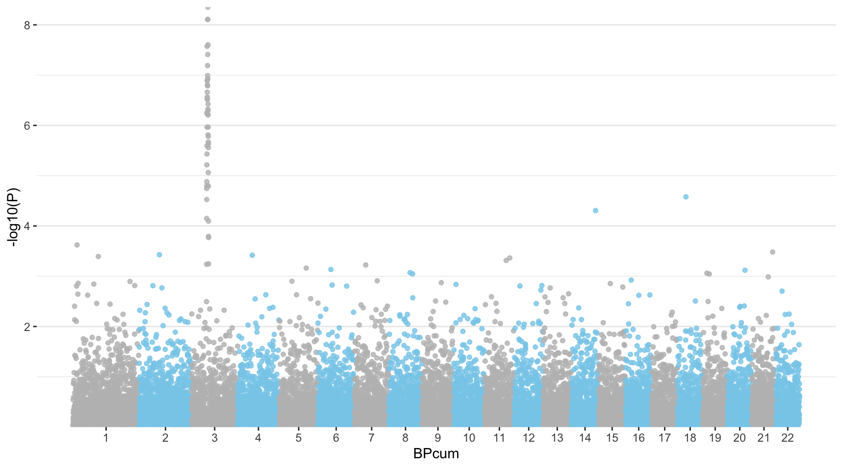
曼哈顿图是一种特定的散点图,在基因组学中广泛用于研究全基因组关联研究(Genome Wide Association Study,GWAS)的结果。每个点代表一个遗传变异。X 轴显示其在染色体上的位置,Y 轴表示其与性状的关联程度。
使用的数据如下:
knitr::kable(head(gwasResults), caption = "曼哈顿图演示数据")| SNP | CHR | BP | P |
|---|---|---|---|
| rs1 | 1 | 1 | 0.9148060 |
| rs2 | 1 | 2 | 0.9370754 |
| rs3 | 1 | 3 | 0.2861395 |
| rs4 | 1 | 4 | 0.8304476 |
| rs5 | 1 | 5 | 0.6417455 |
| rs6 | 1 | 6 | 0.5190959 |
manhattan 函数非常简单:只需正确识别 4 列数据,它就能很好地完成任务
manhattan(gwasResults, chr="CHR", bp="BP", snp="SNP", p="P" )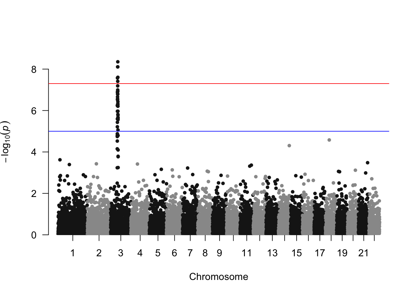
高亮显示曼哈顿图上的 SNP 群体
manhattan(gwasResults, highlight = snpsOfInterest)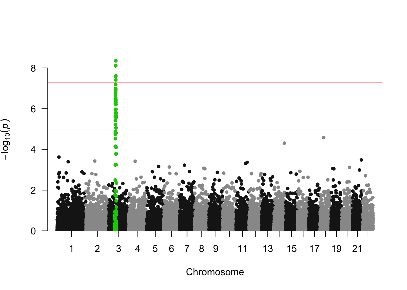
还可以添加文字注释
manhattan(gwasResults, annotatePval = 0.01)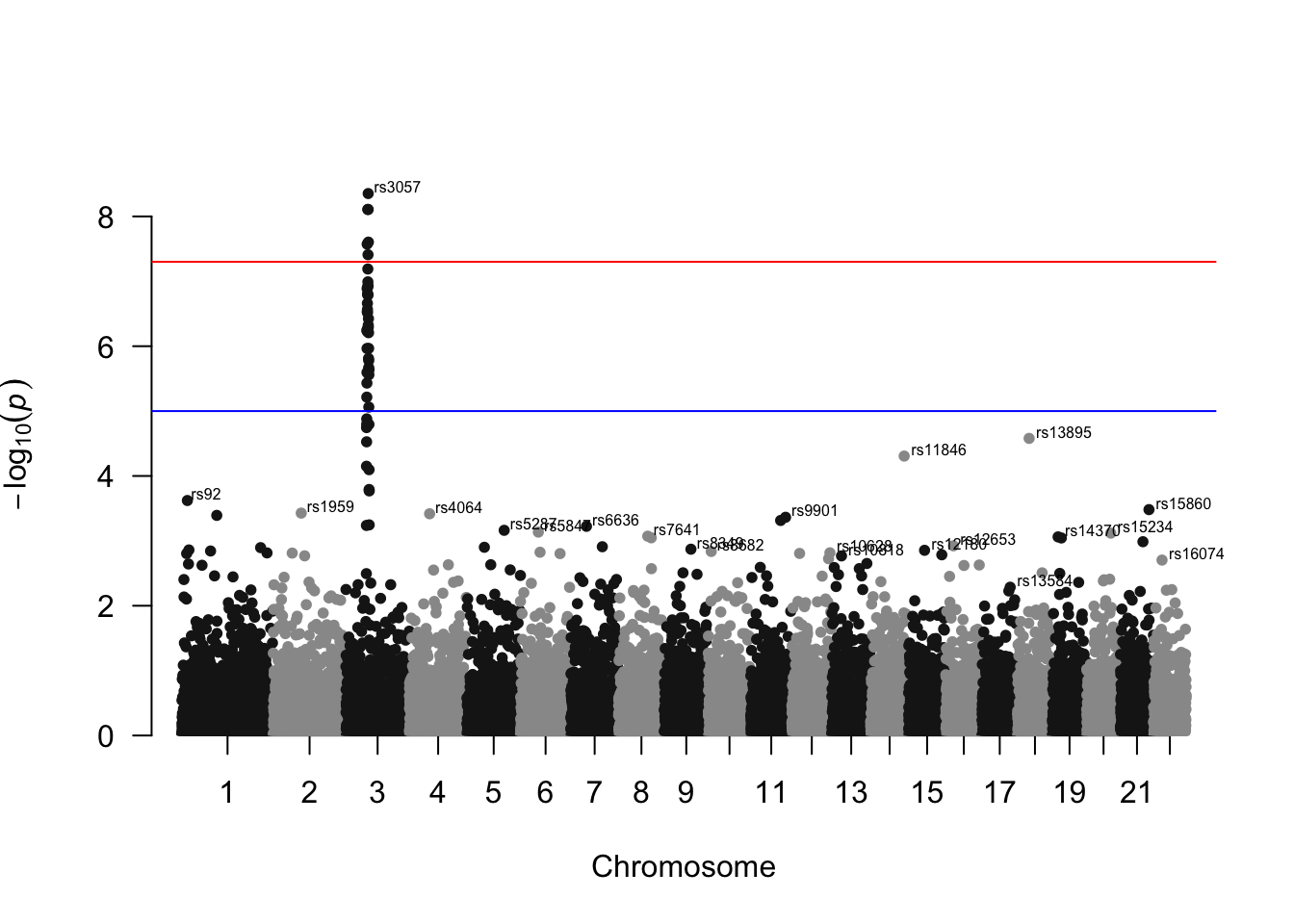
从 GWAS 的输出中绘制 qq 图是一种良好的做法。它允许通过随机性比较 p 值的分布与预期分布。得益于 qq 函数,其实现过程非常直接:
qq(gwasResults$P)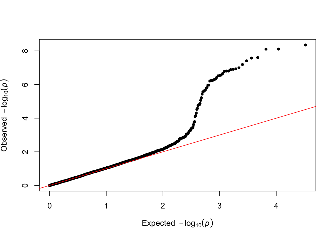
使用 ggplot2 可高度定制曼哈顿图。见 Manhattan
带有智慧文本标签的散点图,见 R-graph-gallery :
# --- 1. 准备工作 ---
# 加载所需的R包
library(ggrepel) # 用于添加智慧型文本标签,避免重叠
library(palmerpenguins) # 提供企鹅数据集
library(randomNames) # 用于生成随机姓名
library(tidyverse) # 加载一系列数据处理和可视化的包,如ggplot2, dplyr, stringr等

# --- 2. 数据加载与处理 ---

# 从 'palmerpenguins' 包中加载 'penguins' 数据集
data("penguins", package = "palmerpenguins")

# 移除数据集中所有包含缺失值(NA)的行,以确保数据干净。
penguins <- drop_na(penguins)

# 生成随机姓名
# set.seed() 用于设置随机数种子,确保每次运行代码时生成的“随机”结果都完全相同。
# 这样可以保证实验的可重复性。
set.seed(2021 + 03 + 27)
# 为数据集中的每一行(每只企鹅)生成一个随机的名字(仅取名字,不取姓)。
name_vector <- randomNames(nrow(penguins), which.names = "first")

# 创建一个名为 'highlight' 的指示变量(列),用于后续标记。
penguins <- penguins %>%
  mutate(
    name = name_vector, # 将随机生成的名字添加到数据集中
    highlight = case_when(
      # case_when 类似于一个 if-else 语句。
      # 如果 'name' 列的字符串是以 "C" 开头的 (str_starts),
      str_starts(name, "C") ~ name, # 那么 'highlight' 列的值就是这个名字
      TRUE ~ "" # 对于所有其他情况,'highlight' 列的值为空字符串 ""
    )
  )

# --- 3. 创建基础图形 ---

# 注意 `color = species` 和 `shape = species`。
# 这意味着每个物种(species)的点都会有不同的颜色和不同的形状。
plt <- ggplot(penguins, aes(x = flipper_length_mm, y = bill_length_mm)) +
  geom_point(
    aes(color = species, shape = species), # 根据物种区分颜色和形状
    size = 1.5, # 设置点的大小
    alpha = 0.8 # 添加一些透明度,因为数据点可能有重叠,透明化有助于观察。
  ) +
  # 使用 scale_color_manual() 手动指定点的颜色。
  scale_color_manual(
    values = c("#386cb0", "#fdb462", "#7fc97f") # 为三个物种分别设置颜色
  )

# --- 4. 添加智慧型文本标签 ---

# 在基础图(plt)上添加 ggrepel 提供的智慧型文本标签层。
plt <- plt +
  geom_text_repel(
    aes(label = highlight), # 标签的内容来自于我们之前创建的'highlight'列。
    # 只有 'highlight' 列不为空的那些点才会被添加标签。
    family = "Poppins", # 设置标签的字体
    size = 3, # 设置标签的字号
    min.segment.length = 0, # 即使标签离点很近,也强制画出连接线段。
    seed = 42, # 为标签的随机布局设置种子,确保每次渲染位置相同。
    box.padding = 0.5, # 标签文本框的内边距。
    max.overlaps = Inf, # 允许显示所有标签,即使它们会重叠(ggrepel会尽力排开)。
    arrow = arrow(length = unit(0.010, "npc")), # 在标签和点之间添加一个箭头。
    nudge_x = .15, # 在x方向上将标签轻微推动一点距离。
    nudge_y = .5, # 在y方向上将标签轻微推动一点距离。
    color = "grey50" # 设置标签和连接线的颜色为中灰色。
  )

# --- 5. 添加标题和进行主题美化 ---

# 在图(plt)上继续添加各种元素
plt <- plt +
  # 使用 labs() 添加坐标轴标签、主标题和副标题
  labs(
    title = "Palmer Penguins Data Visualization",
    subtitle = "Scatter plot of flipper lenth vs bill length",
    x = "flip length (mm)",
    y = "bill length (mm)"
  ) +
  # 使用 theme() 函数对图表的非数据元素(如背景、网格线、字体等)进行精细调整。
  theme(
    # --- 字体设置 ---
    # 为图中所有未被单独指定的文本元素设置一个默认字体。
    text = element_text(family = "Lobster Two", size = 8, color = "black"),

    # --- 图例(Legend)设置 ---
    # 自定义图例中的文本(物种名称)
    legend.text = element_text(size = 9, family = "Roboto"),
    # 自定义图例的标题("species")
    legend.title = element_text(face = "bold", size = 12, family = "Roboto"),
    # 手动设置图例的位置在绘图区域的右下角。c(1, 0)代表(右,下)。
    legend.position = c(1, 0),
    legend.justification = c(1, 0),
    # 移除图例的背景。
    legend.background = element_blank(),
    # 移除图例中每个小图标(key)后面的背景。
    legend.key = element_blank(),

    # --- 标题(Title)设置 ---
    # 自定义主标题的字体、大小、样式和颜色。
    plot.title = element_text(
      family = "Lobster Two",
      size = 20,
      face = "bold",
      color = "#2a475e"
    ),
    # 自定义副标题。
    plot.subtitle = element_text(
      family = "Lobster Two",
      size = 15,
      face = "bold",
      color = "#1b2838"
    ),
    # 设置标题的位置相对于整个绘图区域对齐。
    plot.title.position = "plot",

    # --- 坐标轴(Axis)设置 ---
    # 调整坐标轴刻度标签的文本大小和颜色。
    axis.text = element_text(size = 10, color = "black"),
    # 调整坐标轴标题的文本大小。
    axis.title = element_text(size = 12),
    # 移除坐标轴上的刻度短线。
    axis.ticks = element_blank(),
    # 将坐标轴线设置为比默认更浅的灰色。
    axis.line = element_line(colour = "grey50"),

    # --- 网格线(Grid)设置 ---
    # 移除次要网格线。
    panel.grid.minor = element_blank(),
    # 移除X轴的主要网格线。
    panel.grid.major.x = element_blank(),
    # 保留Y轴的主要网格线,并设置为灰色虚线。
    panel.grid.major.y = element_line(color = "#b4aea9", linetype = "dashed"),

    # --- 背景(Background)设置 ---
    # 为绘图面板(panel,即数据点所在的矩形区域)和整个图表(plot)设置一个浅色的背景。
    panel.background = element_rect(fill = "#fbf9f4", color = "#fbf9f4"),
    plot.background = element_rect(fill = "#fbf9f4", color = "#fbf9f4")
  )

plt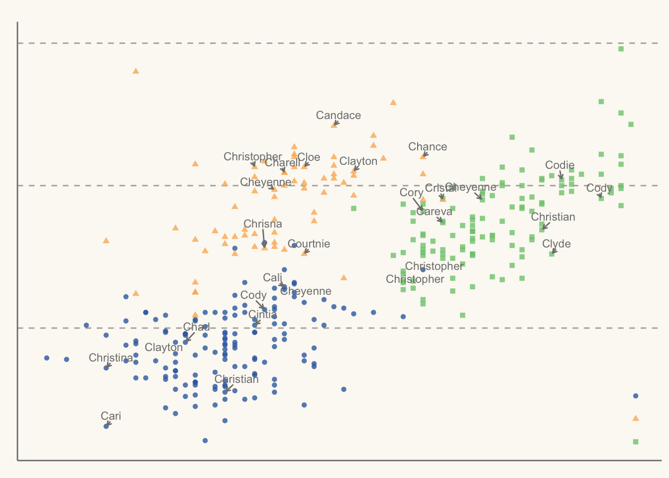
一种美观的带有回归拟合和自动文本排斥的散点图,见 R-graph-gallery :