# Hexbin map {#sec-hexbin-map}
## PKG
```{r}
library(tidyverse)    # 数据处理与可视化核心包
library(sf)           # 用于处理空间数据
library(RColorBrewer) # 用于颜色调色板
library(viridis)      # 提供颜色调色板
library(hrbrthemes)   # 提供额外的主题样式
library(mapdata)      # 提供额外的地图数据
```
## 地图
```{r}
#| fig-cap: 美国州六边形边界地图
# 加载必要的库
library(tidyverse) # 加载tidyverse包,包含dplyr等数据处理工具
library(sf) # 加载sf包,用于处理空间数据
library(RColorBrewer) # 加载RColorBrewer包,用于颜色调色板
# 从以下链接下载六边形边界的GeoJSON格式文件:
# https://team.carto.com/u/andrew/tables/andrew.us_states_hexgrid/public/map
# 读取GeoJSON格式的六边形边界文件
my_sf <- read_sf("./data/us_states_hexgrid.geojson")
# 数据格式调整,去除地名中的" (United States)"字符串
my_sf <- my_sf |> # 使用新管道操作符
mutate(google_name = gsub(" \\(United States\\)", "", google_name)) # 替换地名字符串
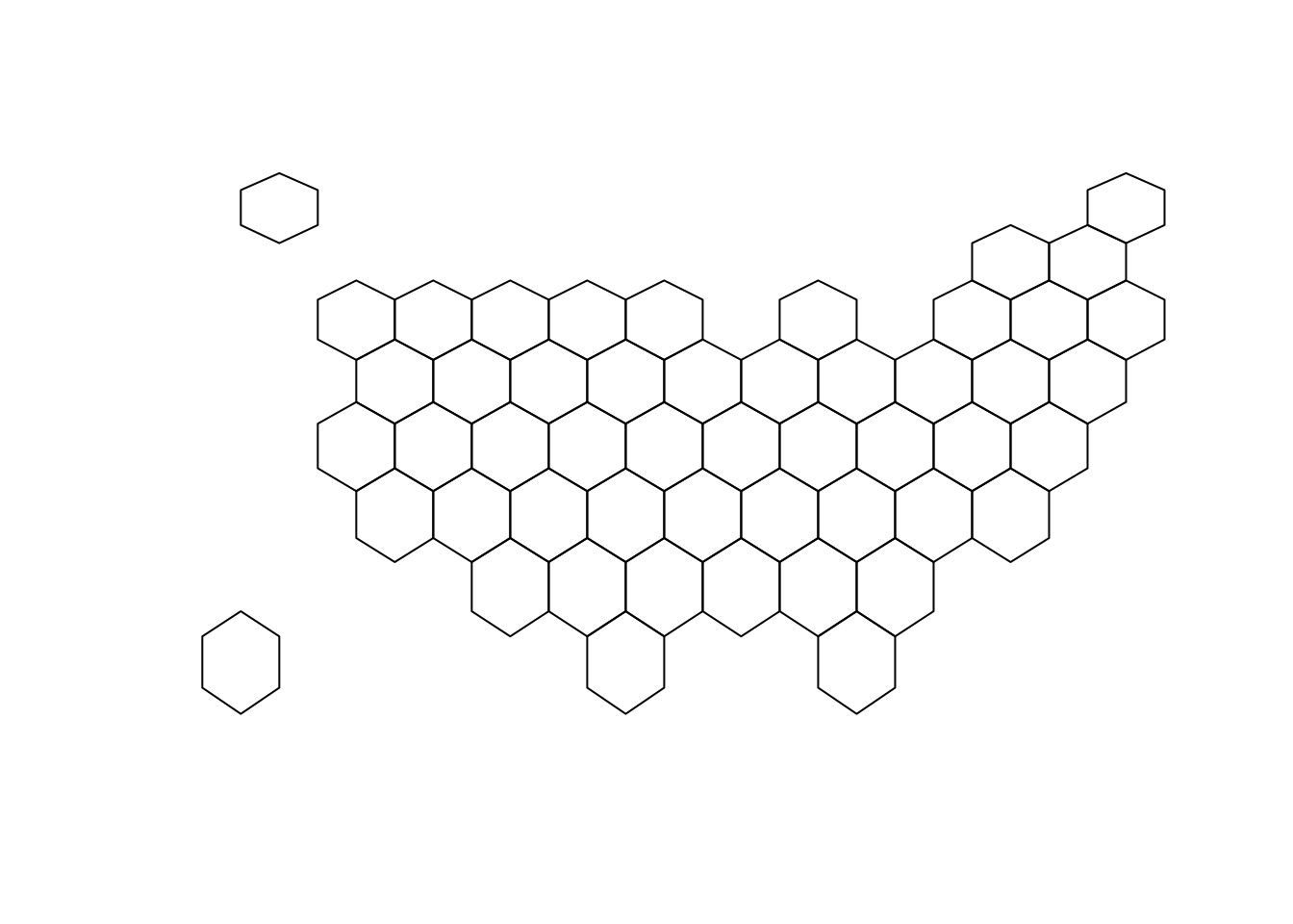
# 绘制空间数据的几何图形
plot(st_geometry(my_sf)) # 绘制六边形边界图
```
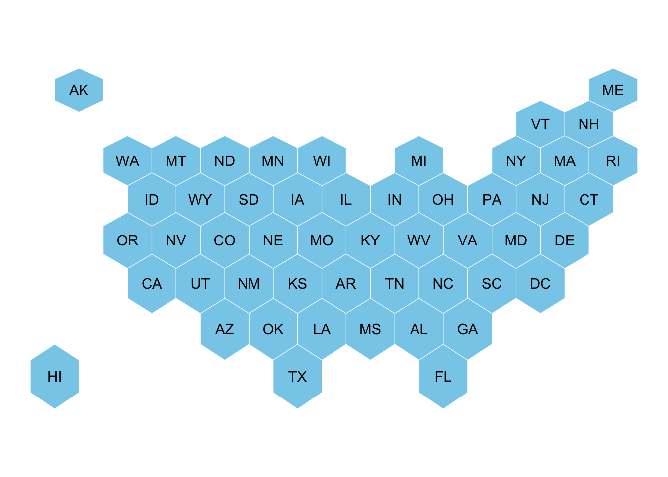
```{r}
#| fig-cap: 美国州六边形地图with州代码标签
ggplot(my_sf) +
  geom_sf(fill = "skyblue", color = "white") + # 绘制六边形填充天蓝色,边界为白色
  geom_sf_text(aes(label = iso3166_2)) +       # 添加州代码文本标签
  theme_void()
```
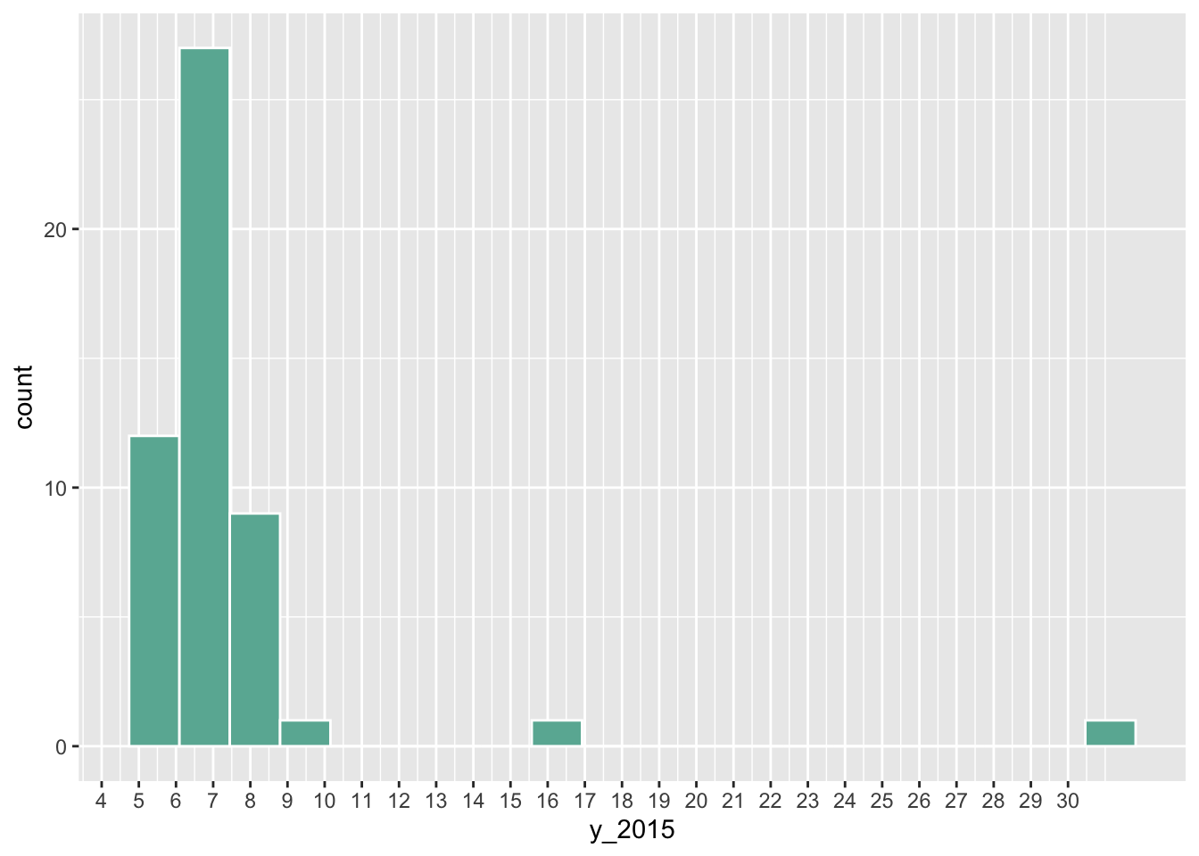
```{r}
#| fig-cap: "2015年美国各州结婚率分布直方图"
# 读取美国各州结婚率数据
data <- read.table("https://raw.githubusercontent.com/holtzy/R-graph-gallery/master/DATA/State_mariage_rate.csv",
  header = T, sep = ",", na.strings = "---"
)

# 绘制2015年结婚率分布直方图
data |>
  ggplot(aes(x = y_2015)) +
  geom_histogram(bins = 20, fill = "#69b3a2", color = "white") +  # 创建直方图,设置颜色
  scale_x_continuous(breaks = seq(1, 30))                         # 设置X轴刻度范围
```
```{r}
#| fig-cap: "2015年美国各州结婚率分布热力图"
# 合并地理空间数据和数值数据
my_sf_wed <- my_sf |>
  left_join(data, by = c("google_name" = "state"))

# 创建第一个分级统计地图
ggplot(my_sf_wed) +
  geom_sf(aes(fill = y_2015)) +              # 绘制地理图形,按2015年结婚率填充颜色
  scale_fill_gradient(trans = "log") +       # 使用对数变换的颜色渐变
  theme_void()                               # 使用空白主题,去除坐标轴等元素
```
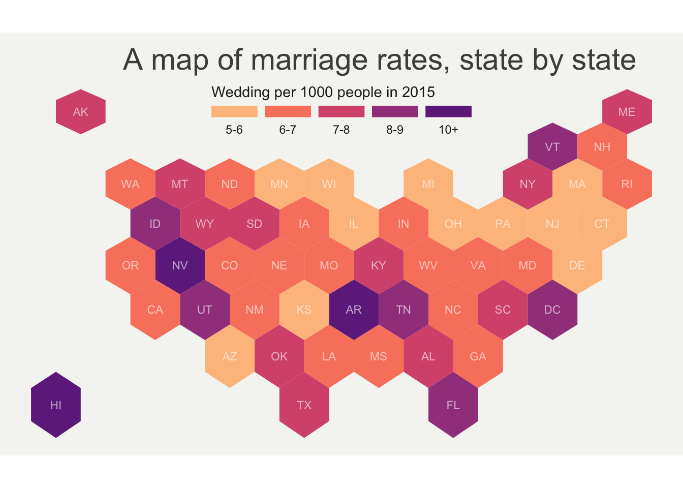
```{r}
#| fig-cap: "2015年美国各州结婚率分布精美地图"
# 准备数据分箱
my_sf_wed$bin <- cut(my_sf_wed$y_2015,
  breaks = c(seq(5, 10), Inf),                                   # 设置分箱断点
  labels = c("5-6", "6-7", "7-8", "8-9", "9-10", "10+"),        # 设置分箱标签
  include.lowest = TRUE                                          # 包含最小值
)

# 准备来自viridis调色板的颜色比例
library(viridis)
my_palette <- rev(magma(8))[c(-1, -8)]                          # 创建自定义调色板

# 绘制地图
ggplot(my_sf_wed) +
  geom_sf(aes(fill = bin), linewidth = 0, alpha = 0.9) +        # 绘制各州地理边界,按分箱填充
  geom_sf_text(aes(label = iso3166_2), color = "white", size = 3, alpha = 0.6) +  # 添加州代码标签
  theme_void() +                                                 # 使用空白主题
  scale_fill_manual(
    values = my_palette,                                         # 使用自定义调色板
    name = "Wedding per 1000 people in 2015",                   # 图例标题
    guide = guide_legend(
      keyheight = unit(3, units = "mm"),                         # 图例高度
      keywidth = unit(12, units = "mm"),                         # 图例宽度
      label.position = "bottom", title.position = "top", nrow = 1  # 图例布局
    )
  ) +
  ggtitle("A map of marriage rates, state by state") +          # 添加标题
  theme(
    legend.position = c(0.5, 0.9),                              # 图例位置
    text = element_text(color = "#22211d"),                      # 文本颜色
    plot.background = element_rect(fill = "#f5f5f2", color = NA),    # 绘图背景
    panel.background = element_rect(fill = "#f5f5f2", color = NA),   # 面板背景
    legend.background = element_rect(fill = "#f5f5f2", color = NA),  # 图例背景
    plot.title = element_text(
      size = 22, hjust = 0.5, color = "#4e4d47",                # 标题样式
      margin = margin(b = -0.1, t = 0.4, l = 2, unit = "cm")   # 标题边距
    )
  )
```
## 坐标列表
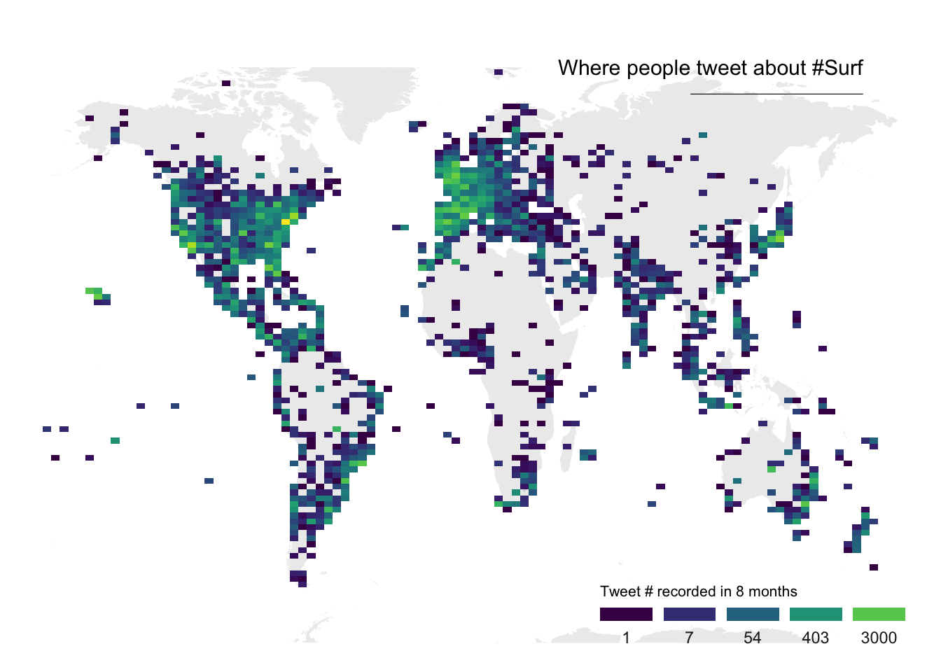
```{r}
#| fig-cap: "全球冲浪推文地理分布热力图"
# 加载所需库
library(tidyverse)
library(viridis)
library(hrbrthemes)
library(mapdata)

# 从GitHub加载数据集
data <- read.table("https://raw.githubusercontent.com/holtzy/data_to_viz/master/Example_dataset/17_ListGPSCoordinates.csv",
                   sep = ",", header = T)

# 获取世界地图多边形数据
world <- map_data("world")

# 绘制地图
ggplot(data, aes(x = homelon, y = homelat)) +
  geom_polygon(data = world, aes(x = long, y = lat, group = group),
               fill = "grey", alpha = 0.3) +                     # 绘制世界地图底图
  geom_bin2d(bins = 100) +                                       # 添加二维密度热力图
  ggplot2::annotate("text", x = 175, y = 80,
                    label = "Where people tweet about #Surf",
                    colour = "black", size = 4, alpha = 1, hjust = 1) +  # 添加标题文本
  ggplot2::annotate("segment", x = 100, xend = 175, y = 73, yend = 73,
                    colour = "black", size = 0.2, alpha = 1) +   # 添加装饰线段
  theme_void() +                                                 # 使用空白主题
  ylim(-70, 80) +                                               # 设置Y轴范围
  scale_fill_viridis(
    trans = "log",                                               # 对数变换
    breaks = c(1, 7, 54, 403, 3000),                           # 设置断点
    name = "Tweet # recorded in 8 months",                      # 图例标题
    guide = guide_legend(
      keyheight = unit(2.5, units = "mm"),                     # 图例高度
      keywidth = unit(10, units = "mm"),                       # 图例宽度
      label.position = "bottom", title.position = "top", nrow = 1  # 图例布局
    )
  ) +
  ggtitle("") +                                                 # 空标题
  theme(
    legend.position = c(0.8, 0.09),                            # 图例位置
    legend.title = element_text(color = "black", size = 8),     # 图例标题样式
    text = element_text(color = "#22211d"),                     # 文本颜色
    plot.title = element_text(size = 13, hjust = 0.1, color = "#4e4d47",
                             margin = margin(b = -0.1, t = 0.4, l = 2, unit = "cm"))  # 标题样式
  )
```
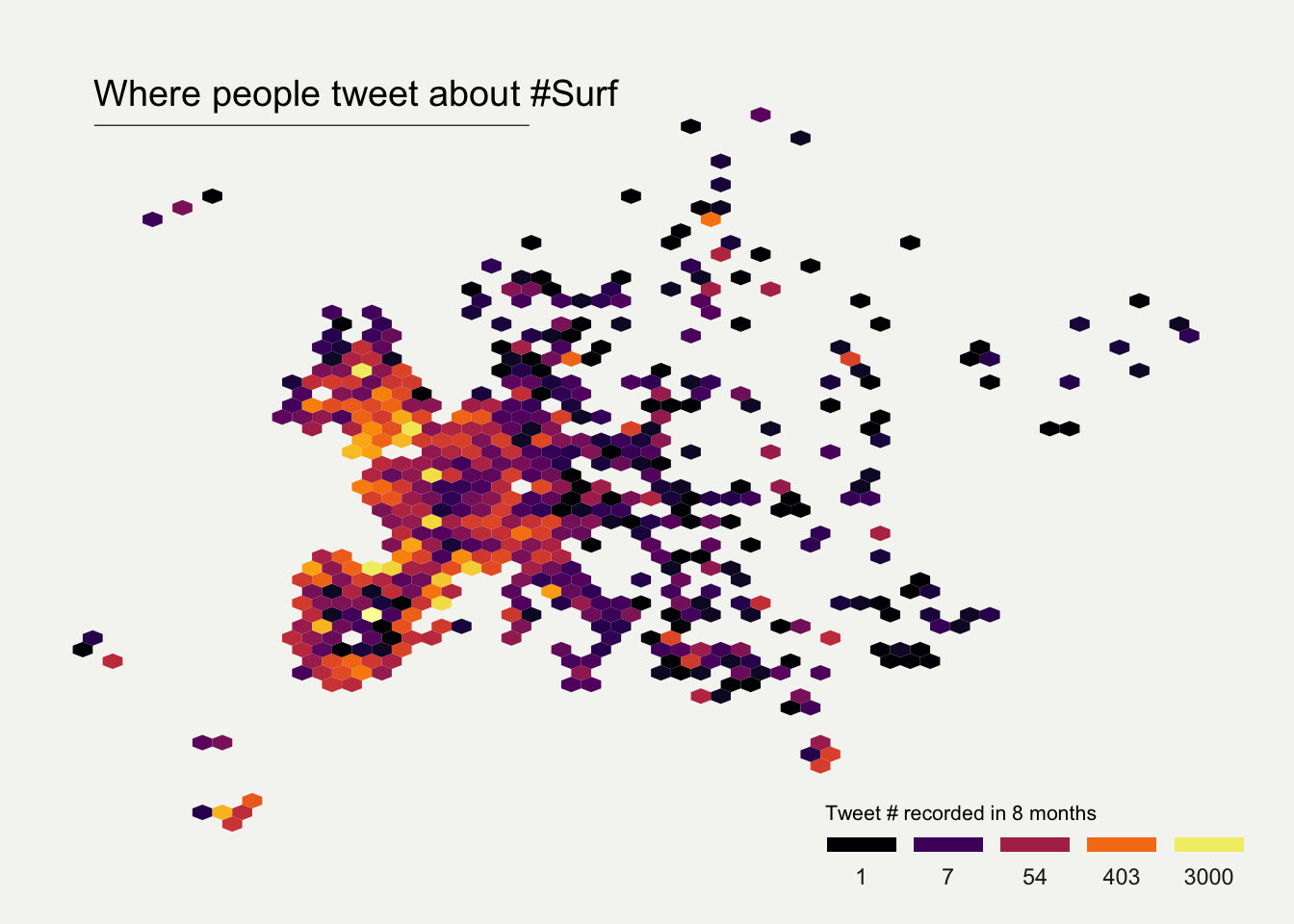
```{r}
#| fig-cap: "欧洲地区冲浪推文地理分布六边形热力图"
# 加载所需库
library(tidyverse)
library(viridis)
library(hrbrthemes)
library(mapdata)

# 从GitHub加载数据集
data <- read.table("https://raw.githubusercontent.com/holtzy/data_to_viz/master/Example_dataset/17_ListGPSCoordinates.csv",
                   sep = ",", header = T)

# 绘制欧洲地区六边形热力图
data |>
  filter(homecontinent == "Europe") |>                          # 筛选欧洲地区数据
  ggplot(aes(x = homelon, y = homelat)) +
  geom_hex(bins = 59) +                                         # 创建六边形热力图
  ggplot2::annotate("text", x = -27, y = 72,
                    label = "Where people tweet about #Surf",
                    colour = "black", size = 5, alpha = 1, hjust = 0) +  # 添加标题文本
  ggplot2::annotate("segment", x = -27, xend = 10, y = 70, yend = 70,
                    colour = "black", size = 0.2, alpha = 1) +   # 添加装饰线段
  theme_void() +                                                 # 使用空白主题
  xlim(-30, 70) +                                               # 设置X轴范围
  ylim(24, 72) +                                                # 设置Y轴范围
  scale_fill_viridis(
    option = "B",                                               # 使用viridis调色板B选项
    trans = "log",                                              # 对数变换
    breaks = c(1, 7, 54, 403, 3000),                           # 设置断点
    name = "Tweet # recorded in 8 months",                      # 图例标题
    guide = guide_legend(
      keyheight = unit(2.5, units = "mm"),                     # 图例高度
      keywidth = unit(10, units = "mm"),                       # 图例宽度
      label.position = "bottom", title.position = "top", nrow = 1  # 图例布局
    )
  ) +
  ggtitle("") +                                                 # 空标题
  theme(
    legend.position = c(0.8, 0.09),                            # 图例位置
    legend.title = element_text(color = "black", size = 8),     # 图例标题样式
    text = element_text(color = "#22211d"),                     # 文本颜色
    plot.background = element_rect(fill = "#f5f5f2", color = NA),    # 绘图背景
    panel.background = element_rect(fill = "#f5f5f2", color = NA),   # 面板背景
    legend.background = element_rect(fill = "#f5f5f2", color = NA),  # 图例背景
    plot.title = element_text(size = 13, hjust = 0.1, color = "#4e4d47",
                             margin = margin(b = -0.1, t = 0.4, l = 2, unit = "cm"))  # 标题样式
  )
```
## Pearl
[](https://r-graph-gallery.com/web-choropleth-map-lego-style.html)
[](https://r-graph-gallery.com/web-triple-map-into-a-single-chart.html)