Show/Hide Code
library(tidyverse)  # 数据处理核心包
library(viridis)    # 颜色方案
library(patchwork)  # 图形拼接
library(hrbrthemes) # 图形主题
library(igraph)     # 图论和网络分析
library(ggraph)     # 基于ggplot2的图形语法
library(colormap) # 颜色映射library(tidyverse) # 数据处理核心包
library(viridis) # 颜色方案
library(patchwork) # 图形拼接
library(hrbrthemes) # 图形主题
library(igraph) # 图论和网络分析
library(ggraph) # 基于ggplot2的图形语法
library(colormap) # 颜色映射这里有一个简单的例子。6 个节点之间的 5 个连接分别用二维网络图(左)和弧形图(右)表示
# 加载必要的库
library(tidyverse)    # 数据处理核心包
library(viridis)      # 颜色方案
library(patchwork)    # 图形拼接
library(hrbrthemes)   # 图形主题
library(igraph)       # 图论和网络分析
library(ggraph)       # 基于ggplot2的图形语法
library(colormap)     # 颜色映射

# 创建一个简单的边列表
links <- data.frame(
  source = c("A", "A", "A", "A", "B"),  # 源节点
  target = c("B", "C", "D", "F", "E")   # 目标节点
)

# 转换为igraph对象
mygraph <- graph_from_data_frame(links)

# 创建传统的2D网络图
p1 <- ggraph(mygraph) +
  geom_edge_link(                           # 绘制边连接
    edge_colour = "black",
    edge_alpha = 0.3,
    edge_width = 0.2
  ) +
  geom_node_point(                          # 绘制节点
    color = "#69b3a2",
    size = 5
  ) +
  geom_node_text(                           # 添加节点标签
    aes(label = name),
    repel = TRUE,
    size = 8,
    color = "#69b3a2"
  ) +
  theme_void() +                            # 使用空白主题
  theme(
    legend.position = "none",               # 隐藏图例
    plot.margin = unit(rep(2, 4), "cm")     # 设置边距
  )

# 创建弧形图
p2 <- ggraph(mygraph, layout = "linear") +  # 使用线性布局
  geom_edge_arc(                            # 绘制弧形边
    edge_colour = "black",
    edge_alpha = 0.3,
    edge_width = 0.2
  ) +
  geom_node_point(                          # 绘制节点
    color = "#69b3a2",
    size = 5
  ) +
  geom_node_text(                           # 添加节点标签
    aes(label = name),
    repel = FALSE,
    size = 8,
    color = "#69b3a2",
    nudge_y = -0.1                          # 标签向下偏移
  ) +
  theme_void() +                            # 使用空白主题
  theme(
    legend.position = "none",               # 隐藏图例
    plot.margin = unit(rep(2, 4), "cm")     # 设置边距
  )

# 使用patchwork拼接两个图
p1 + p2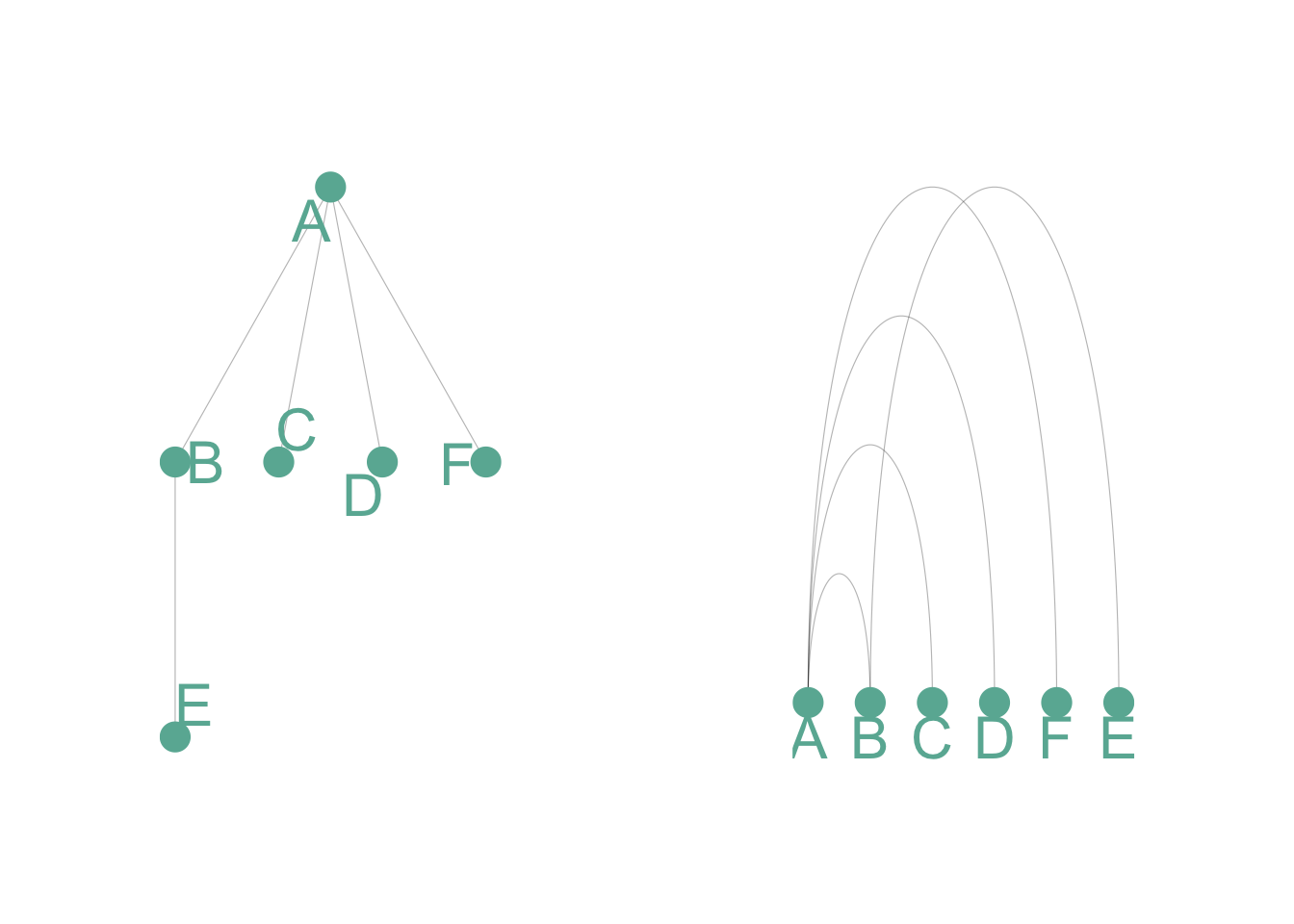
弧图在传达整体节点结构方面不如二维网络图。但它有两个主要优势:
- 如果节点顺序优化,它可以很好地突出显示集群和桥梁
- 它允许显示每个节点的标签,这在二维结构中通常是不可行的。# 加载数据
dataUU <- read.table(
"https://raw.githubusercontent.com/holtzy/data_to_viz/master/Example_dataset/13_AdjacencyUndirectedUnweighted.csv",
header = TRUE
)
# 将邻接矩阵转换为长格式
connect <- dataUU |>
gather(key = "to", value = "value", -1) |> # 宽转长格式
mutate(to = gsub("\\.", " ", to)) |> # 替换点号为空格
na.omit() # 移除缺失值
# 计算每个人的连接数
c(as.character(connect$from), as.character(connect$to)) |>
as_tibble() |> # 转换为tibble格式
group_by(value) |> # 按人名分组
summarize(n = n()) -> coauth # 计算连接数
colnames(coauth) <- c("name", "n") # 重命名列
# 使用igraph创建图对象
mygraph <- graph_from_data_frame(
connect,
vertices = coauth,
directed = FALSE # 无向图
)
# 寻找社区结构
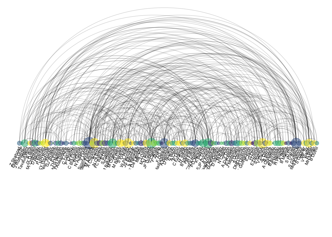
com <- walktrap.community(mygraph) # 使用随机游走算法检测社区
# 重新排序数据集并创建图
coauth <- coauth |>
mutate(grp = com$membership) |> # 添加社区分组信息
arrange(grp) |> # 按分组排序
mutate(name = factor(name, name)) # 将名称转为因子
# 只保留前15个社区
coauth <- coauth |>
filter(grp < 16)
# 在边数据中只保留这些人员
connect <- connect |>
filter(from %in% coauth$name) |> # 过滤源节点
filter(to %in% coauth$name) # 过滤目标节点
# 重新创建图对象
mygraph <- graph_from_data_frame(
connect,
vertices = coauth,
directed = FALSE
)
# 在viridis色阶中准备颜色向量
mycolor <- colormap(
colormap = colormaps$viridis,
nshades = max(coauth$grp) # 根据社区数设置颜色数
)
mycolor <- sample(mycolor, length(mycolor)) # 随机打乱颜色
# 创建弧形图
ggraph(mygraph, layout = "linear") + # 线性布局
geom_edge_arc( # 绘制弧形边
edge_colour = "black",
edge_alpha = 0.2,
edge_width = 0.3,
fold = TRUE # 折叠重叠边
) +
geom_node_point( # 绘制节点
aes(size = n, color = as.factor(grp), fill = grp),
alpha = 0.5 # 透明度
) +
scale_size_continuous(range = c(0.5, 8)) + # 节点大小范围
scale_color_manual(values = mycolor) + # 手动颜色映射
geom_node_text( # 添加节点标签
aes(label = name),
angle = 65, # 文字倾斜角度
hjust = 1, # 水平对齐方式
nudge_y = -1.1, # 垂直偏移
size = 2.3 # 文字大小
) +
theme_void() + # 空白主题
theme(
legend.position = "none", # 隐藏图例
plot.margin = unit(c(0, 0, 0.4, 0), "null"), # 图形边距
panel.spacing = unit(c(0, 0, 3.4, 0), "null") # 面板间距
) +
expand_limits( # 扩展坐标轴范围
x = c(-1.2, 1.2),
y = c(-5.6, 1.2)
)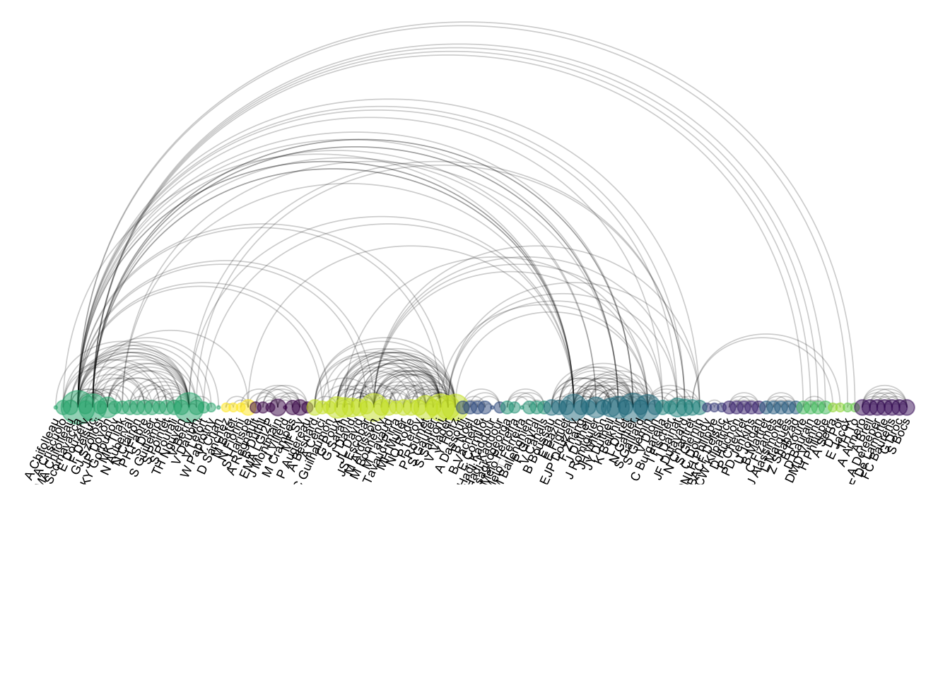
顺序很重要,顺序不对就是个灾难:
# 随机重新排序数据集
coauth <- coauth |>
  slice(sample(c(1:nrow(coauth)), nrow(coauth)))  # 随机抽样重排

# 使用igraph创建图对象
mygraph <- graph_from_data_frame(
  connect,
  vertices = coauth,
  directed = FALSE                                 # 无向图
)

# 在viridis色阶中准备n个颜色的向量
mycolor <- colormap(
  colormap = colormaps$viridis,
  nshades = max(coauth$grp)                       # 根据分组数设置颜色数
)
mycolor <- sample(mycolor, length(mycolor))       # 随机打乱颜色顺序

# 创建弧形图
ggraph(mygraph, layout = "linear") +              # 线性布局
  geom_edge_arc(                                  # 绘制弧形边
    edge_colour = "black",
    edge_alpha = 0.2,
    edge_width = 0.3,
    fold = TRUE                                   # 折叠边
  ) +
  geom_node_point(                                # 绘制节点
    aes(size = n, color = as.factor(grp), fill = grp),
    alpha = 0.5
  ) +
  scale_size_continuous(range = c(0.5, 8)) +      # 节点大小范围
  scale_color_manual(values = mycolor) +          # 手动设置颜色
  geom_node_text(                                 # 添加节点标签
    aes(label = name),
    angle = 65,                                   # 文字角度
    hjust = 1,                                    # 水平对齐
    nudge_y = -1.1,                              # 垂直偏移
    size = 2.3                                    # 文字大小
  ) +
  theme_void() +                                  # 空白主题
  theme(
    legend.position = "none",                     # 隐藏图例
    plot.margin = unit(c(0, 0, 0.4, 0), "null"), # 图形边距
    panel.spacing = unit(c(0, 0, 3.4, 0), "null") # 面板间距
  ) +
  expand_limits(                                  # 扩展坐标轴范围
    x = c(-1.2, 1.2),
    y = c(-5.6, 1.2)
  )