Show/Hide Code
library(RColorBrewer) # 加载RColorBrewer包用于调色板
library(tidyverse)
library(likert) # 加载likert包用于处理分组条形图
library(viridis) # 加载viridis包用于调色板
library(hrbrthemes) # 加载hrbrthemes包用于美化图形关于堆叠的讲解,见 data-to-viz
library(RColorBrewer) # 加载RColorBrewer包用于调色板
library(tidyverse)
library(likert) # 加载likert包用于处理分组条形图
library(viridis) # 加载viridis包用于调色板
library(hrbrthemes) # 加载hrbrthemes包用于美化图形ggplot2dodge分组条形图(并列 dodge):
# 构建数据集
# specie:物种名称,共4种,每种3个观测
specie <- c(
  rep("sorgho", 3),
  rep("poacee", 3),
  rep("banana", 3),
  rep("triticum", 3)
)
# condition:实验条件,共3种(normal、stress、Nitrogen),每种物种下各有3个条件
condition <- rep(c("normal", "stress", "Nitrogen"), 4)
# value:生成12个服从正态分布的随机数,取绝对值作为观测值
value <- abs(rnorm(12, 0, 15))
# 将数据整合为数据框
data <- data.frame(specie, condition, value)

# 绘制分组条形图
ggplot(data, aes(fill = condition, y = value, x = specie)) +
  geom_bar(position = "dodge", stat = "identity") + # position="dodge"并列
  scale_fill_brewer(palette = "Set2") + # 颜色
  theme_minimal() + # 使用简洁主题
  theme(legend.position = "bottom") # 图例位置在底部
stack分组条形图(堆叠 stack):
ggplot(data, aes(fill = condition, y = value, x = specie)) +
  geom_bar(position = "stack", stat = "identity") + # position="stack"堆叠
  scale_fill_brewer(palette = "Set2") + # 颜色
  theme_minimal() + # 使用简洁主题
  theme(legend.position = "bottom") # 图例位置在底部
fill分组条形图(百分比堆叠 fill):
ggplot(data, aes(fill=condition, y=value, x=specie)) +
  geom_bar(position="fill", stat="identity") + # position="fill"百分比堆叠
  scale_fill_brewer(palette = "Set2") + # 颜色
  theme_minimal() + # 使用简洁主题
  theme(legend.position = "bottom") # 图例位置在底部
# 使用ggplot2绘制分组条形图(堆叠形式)
ggplot(data, aes(fill = condition, y = value, x = specie)) +
    geom_bar(position = "stack", stat = "identity") +     # 堆叠条形图
    scale_fill_viridis(discrete = TRUE) +   # 使用viridis调色板,提升色盲友好性
    ggtitle("Studying 4 species..") +      # 添加主标题
    theme_ipsum() +        # 使用hrbrthemes包的ipsum主题美化图形
    xlab("")               # 去除x轴标签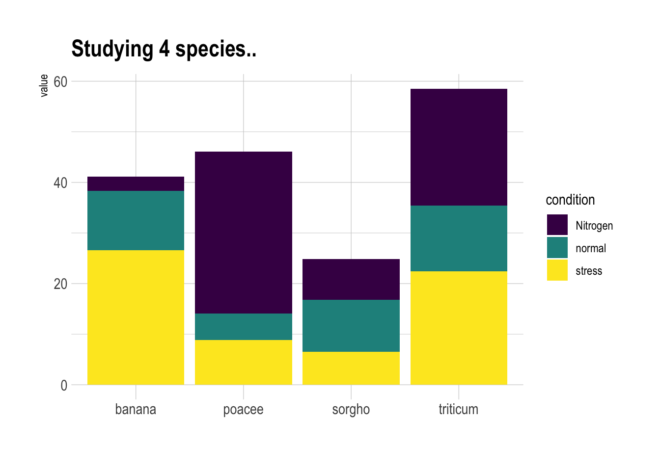
# 使用ggplot2绘制分组条形图(分面显示每个物种)
ggplot(data, aes(fill = condition, y = value, x = condition)) +
    geom_bar(position = "dodge", stat = "identity") + # position="dodge"并列条形
    scale_fill_viridis(discrete = TRUE, option = "E") + # 使用viridis调色板,提升色盲友好性
    ggtitle("Studying 4 species..") + # 添加主标题
    facet_wrap(~specie) + # 按物种分面显示,每个物种一个子图
    theme_ipsum() + # 使用hrbrthemes包的ipsum主题美化图形
    theme(legend.position = "none") + # 不显示图例
    xlab("") # 去除x轴标签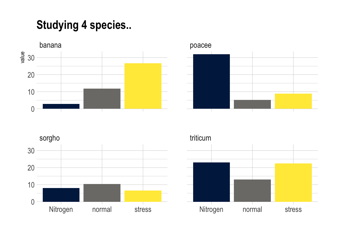
# 构建数据集
data <- tribble(
  ~x, ~groupA, ~groupB, ~groupC, ~groupD,
  "Jan",   12,     19,     -9,      2,
  "Feb",   16,     21,    -13,      8,
  "Mar",   23,     21,    -24,      9,
  "Apr",   38,     34,     25,     23,
  "May",   42,     46,     34,     26,
  "Jun",   34,     42,     32,     26,
  "Jul",    2,     34,     21,     27,
  "Aug",   21,     32,    -16,     18,
  "Sept",  18,     31,    -18,     12,
  "Oct",   12,     21,    -14,     10,
  "Nov",   12,     18,    -14,     10,
  "Dec",    2,      8,      4,     10
)
# 长数据
data_long <- data |>
  pivot_longer(
    -x,
    names_to = "group",
    values_to = "value"
  ) |>
  mutate(
    x = factor(
      x,
      levels = c(
        "Jan",
        "Feb",
        "Mar",
        "Apr",
        "May",
        "Jun",
        "Jul",
        "Aug",
        "Sept",
        "Oct"
      )
    )
  )

# 绘制分组条形图(堆叠形式)
ggplot(data_long, aes(fill = group, y = value, x = x)) +
  geom_bar(position = "stack", stat = "identity")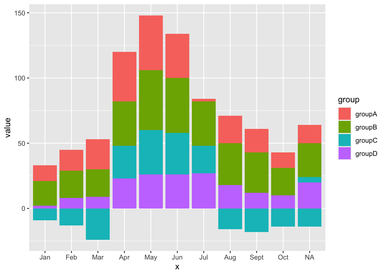
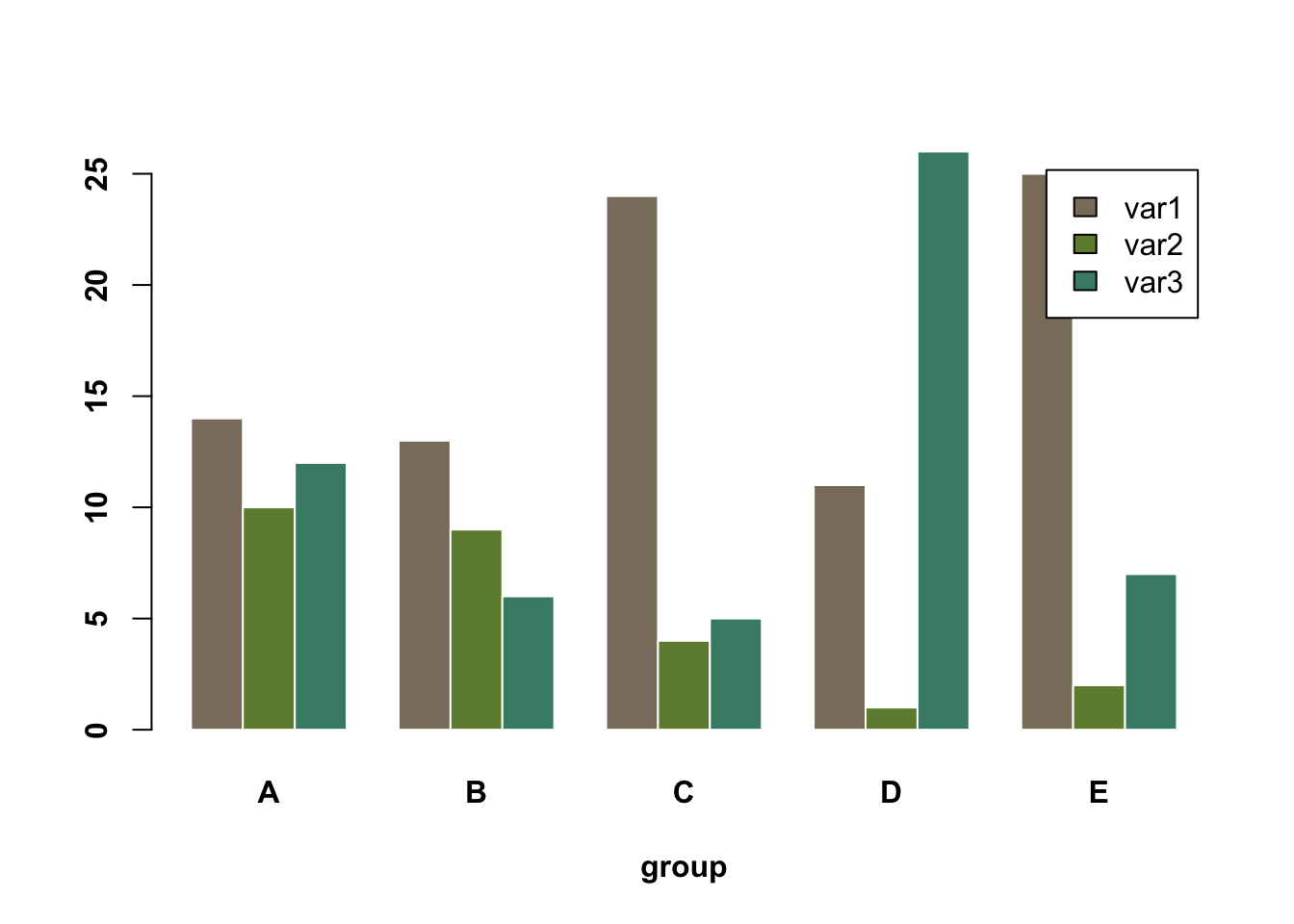
Base R# 设置随机种子,保证每次生成的数据一致
set.seed(112)
# 生成一个3行5列的矩阵,元素为1到30之间的随机整数
data <- matrix(sample(1:30, 15), nrow = 3)
colnames(data) <- c("A", "B", "C", "D", "E")
rownames(data) <- c("var1", "var2", "var3")
# 绘制分组条形图
barplot(
data,
col = colors()[c(23, 89, 12)], # 设置每个变量的颜色
border = "white", # 条形边框为白色
font.axis = 2, # 坐标轴字体加粗
beside = TRUE, # 分组显示条形
legend = rownames(data), # 添加图例,显示变量名
xlab = "group", # x轴标签
font.lab = 2 # 坐标轴标签加粗
)
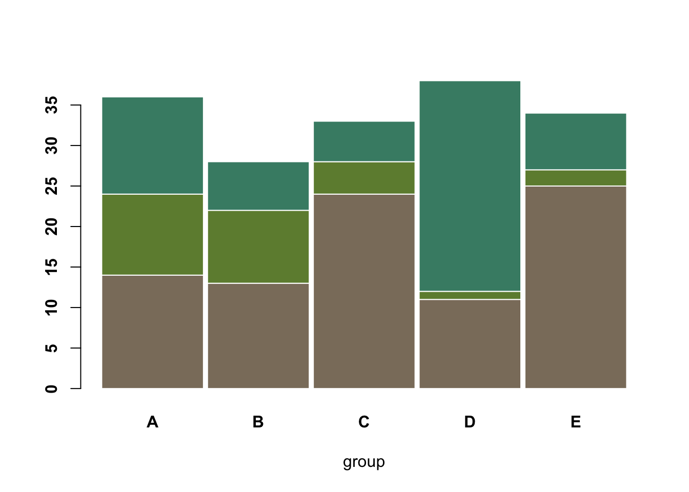
# 绘制堆叠分组条形图
barplot(
    data,
    col = colors()[c(23, 89, 12)], # 设置每个变量的颜色
    border = "white",              # 条形边框为白色
    space = 0.04,                  # 分组之间的间隔
    font.axis = 2,                 # 坐标轴字体加粗
    xlab = "group"                 # x轴标签
)
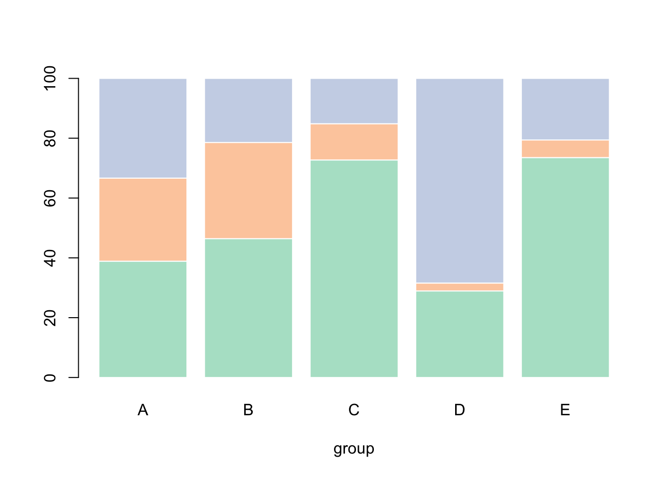
# 加载RColorBrewer包用于调色板
library(RColorBrewer)

# 创建3种Pastel2配色方案的颜色
coul <- brewer.pal(3, "Pastel2")

# 将原始数据转换为百分比形式
# 对每一列(每个分组)进行处理,使每个变量的数值占该分组总和的百分比
data_percentage <- apply(
    data,
    2,  # 按列处理
    function(x) { x * 100 / sum(x, na.rm = TRUE) }
)

# 绘制百分比堆叠条形图
barplot(
    data_percentage,         # 百分比数据
    col = coul,              # 设置颜色
    border = "white",        # 条形边框为白色
    xlab = "group"           # x轴标签
)
Likert 量表分组条形图:
# 加载likert包,用于处理Likert量表数据
library(likert)

# 使用likert包自带的数据集pisaitems
data(pisaitems)

# 从pisaitems数据集中筛选变量名以"ST24Q"开头的题目,作为Likert量表条目
items28 <- pisaitems[, substr(names(pisaitems), 1, 5) == "ST24Q"]

# 构建Likert对象,对Likert量表数据进行汇总和处理
p <- likert(items28)

plot(p)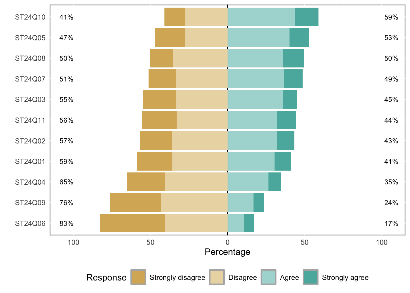
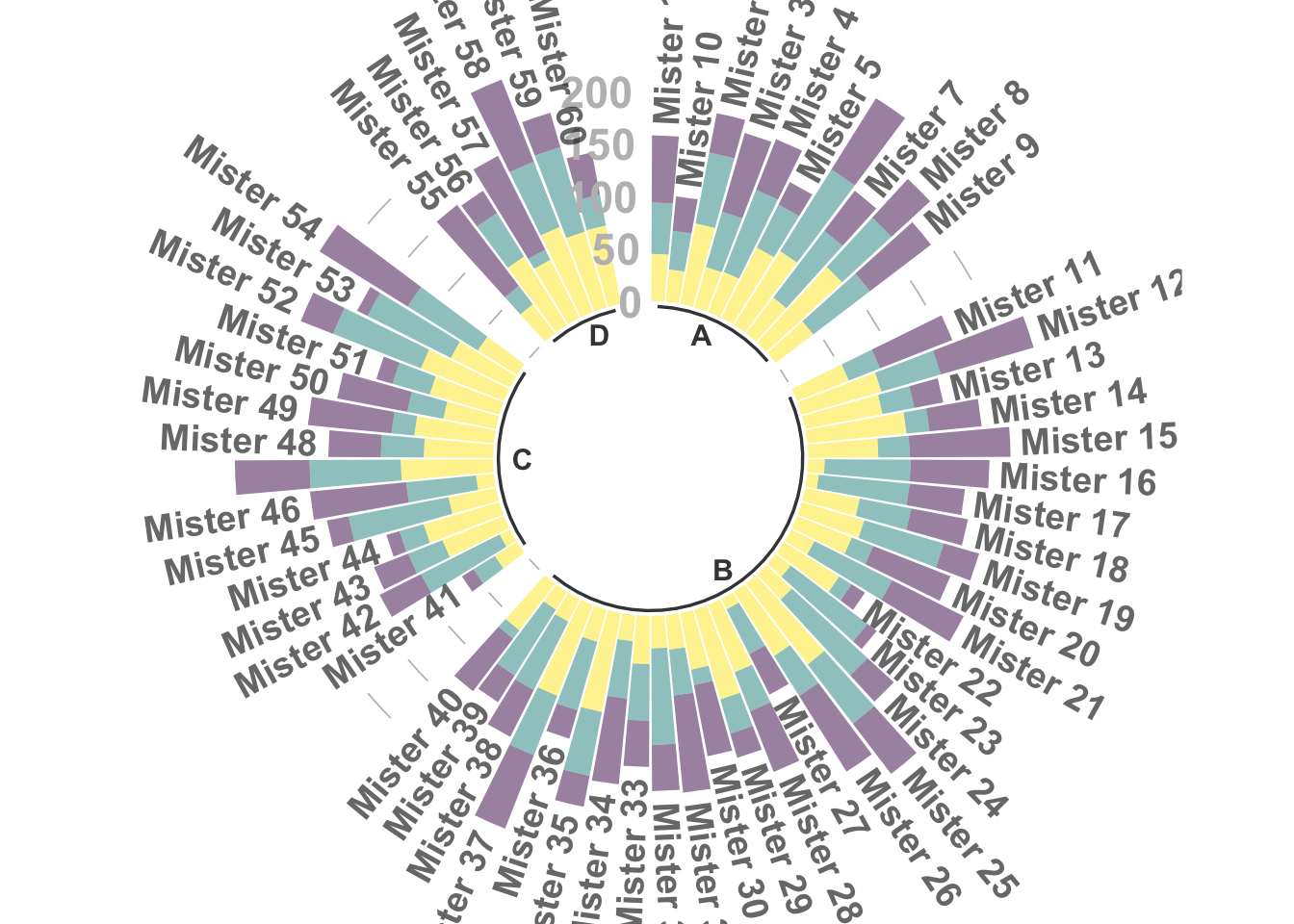
极坐标形式的分组堆叠条形图
library(tidyverse) # 数据处理和可视化
library(viridis) # 色盲友好的调色板

# 构建数据集
data <- data.frame(
  individual = paste("Mister ", seq(1, 60), sep = ""), # 60个个体
  group = factor(c(rep('A', 10), rep('B', 30), rep('C', 14), rep('D', 6))), # 分为4组
  value1 = sample(seq(10, 100), 60, replace = T), # 观测1
  value2 = sample(seq(10, 100), 60, replace = T), # 观测2
  value3 = sample(seq(10, 100), 60, replace = T) # 观测3
)

# 转换为长数据格式,便于ggplot绘图
data <- data |>
  pivot_longer(
    cols = value1:value3,
    names_to = "observation",
    values_to = "value"
  )

# 设置每组后面添加的空白条数,使分组更明显
empty_bar <- 2
nObsType <- nlevels(as.factor(data$observation)) # 观测类型数
to_add <- data.frame(matrix(
  NA,
  empty_bar * nlevels(data$group) * nObsType,
  ncol(data)
))
colnames(to_add) <- colnames(data)
to_add$group <- rep(levels(data$group), each = empty_bar * nObsType)
data <- rbind(data, to_add)
data <- data |> arrange(group, individual)
data$id <- rep(seq(1, nrow(data) / nObsType), each = nObsType) # 为每个个体分配唯一id,作为X轴

# 计算每个标签的总值和角度,用于后续标签显示
label_data <- data |> group_by(id, individual) |> summarize(tot = sum(value))
number_of_bar <- nrow(label_data)
angle <- 90 - 360 * (label_data$id - 0.5) / number_of_bar # 计算标签角度
label_data$hjust <- ifelse(angle < -90, 1, 0) # 标签对齐方式
label_data$angle <- ifelse(angle < -90, angle + 180, angle) # 角度调整

# 计算每组的起止位置,用于分组底线和分组标签
base_data <- data |>
  group_by(group) |>
  summarize(start = min(id), end = max(id) - empty_bar) |>
  rowwise() |>
  mutate(title = mean(c(start, end)))

# 计算分组之间的网格线位置
grid_data <- base_data
grid_data$end <- grid_data$end[c(nrow(grid_data), 1:nrow(grid_data) - 1)] + 1
grid_data$start <- grid_data$start - 1
grid_data <- grid_data[-1, ]

# 绘制极坐标分组条形图
ggplot(data) +
  # 堆叠条形
  geom_bar(
    aes(x = as.factor(id), y = value, fill = observation),
    stat = "identity",
    alpha = 0.5
  ) +
  scale_fill_viridis(discrete = TRUE) + # 使用viridis调色板

  # 添加网格线(0/50/100/150/200)
  geom_segment(
    data = grid_data,
    aes(x = end, y = 0, xend = start, yend = 0),
    colour = "grey",
    alpha = 1,
    linewidth = 0.3,
    inherit.aes = FALSE
  ) +
  geom_segment(
    data = grid_data,
    aes(x = end, y = 50, xend = start, yend = 50),
    colour = "grey",
    alpha = 1,
    linewidth = 0.3,
    inherit.aes = FALSE
  ) +
  geom_segment(
    data = grid_data,
    aes(x = end, y = 100, xend = start, yend = 100),
    colour = "grey",
    alpha = 1,
    linewidth = 0.3,
    inherit.aes = FALSE
  ) +
  geom_segment(
    data = grid_data,
    aes(x = end, y = 150, xend = start, yend = 150),
    colour = "grey",
    alpha = 1,
    linewidth = 0.3,
    inherit.aes = FALSE
  ) +
  geom_segment(
    data = grid_data,
    aes(x = end, y = 200, xend = start, yend = 200),
    colour = "grey",
    alpha = 1,
    linewidth = 0.3,
    inherit.aes = FALSE
  ) +

  # 添加网格线数值标签
  ggplot2::annotate(
    "text",
    x = rep(max(data$id), 5),
    y = c(0, 50, 100, 150, 200),
    label = c("0", "50", "100", "150", "200"),
    color = "grey",
    size = 6,
    angle = 0,
    fontface = "bold",
    hjust = 1
  ) +

  ylim(-150, max(label_data$tot, na.rm = T)) + # y轴范围
  theme_minimal() +
  theme(
    legend.position = "none", # 不显示图例
    axis.text = element_blank(), # 不显示坐标轴文本
    axis.title = element_blank(), # 不显示坐标轴标题
    panel.grid = element_blank(), # 不显示面板网格
    plot.margin = unit(rep(-1, 4), "cm") # 缩小图形边距
  ) +
  coord_polar() + # 极坐标变换

  # 添加每个个体的标签
  geom_text(
    data = label_data,
    aes(x = id, y = tot + 10, label = individual, hjust = hjust),
    color = "black",
    fontface = "bold",
    alpha = 0.6,
    size = 5,
    angle = label_data$angle,
    inherit.aes = FALSE
  ) +

  # 添加分组底线
  geom_segment(
    data = base_data,
    aes(x = start, y = -5, xend = end, yend = -5),
    colour = "black",
    alpha = 0.8,
    size = 0.6,
    inherit.aes = FALSE
  ) +
  # 添加分组标签
  geom_text(
    data = base_data,
    aes(x = title, y = -18, label = group),
    hjust = c(1, 1, 0, 0),
    colour = "black",
    alpha = 0.8,
    size = 4,
    fontface = "bold",
    inherit.aes = FALSE
  )