Show/Hide Code
# 加载必要的包
library(tidyverse)    # 数据处理和可视化
library(gapminder)    # 全球发展数据集
library(hrbrthemes)   # 主题样式
library(viridis)      # 配色方案
library(plotly) # 交互式图表# 加载必要的包
library(tidyverse) # 数据处理和可视化
library(gapminder) # 全球发展数据集
library(hrbrthemes) # 主题样式
library(viridis) # 配色方案
library(plotly) # 交互式图表size气泡图(Bubble)是一种散点图,增加了第三个维度:通过点的尺寸来表示另一个数值变量的值。
# 筛选2007年的数据,去除年份列
data <- gapminder |> filter(year == "2007") |> dplyr::select(-year)

# 创建气泡图:x轴为人均GDP,y轴为预期寿命,size为人口数量
ggplot(data, aes(x = gdpPercap, y = lifeExp, size = pop)) +
  geom_point(alpha = 0.7) +           # 透明度设为0.7
  theme(legend.position = "bottom")    # 图例放在底部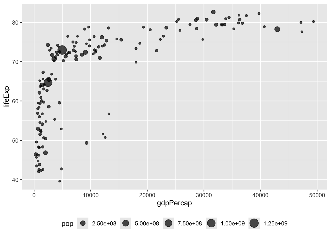
scale_size()通过scale_size()可以调整气泡的大小。range 和 name 参数设置气泡的大小范围和图例名称。
data |>
  arrange(desc(pop)) |>                              # 按人口数量降序排列
  mutate(country = factor(country, country)) |>      # 将国家名转换为因子
  ggplot(aes(x = gdpPercap, y = lifeExp, size = pop)) +
  geom_point(alpha = 0.5) +                          # 设置点的透明度
  scale_size(range = c(.1, 24), name = "Population (M)")  # 调整气泡大小范围和图例名称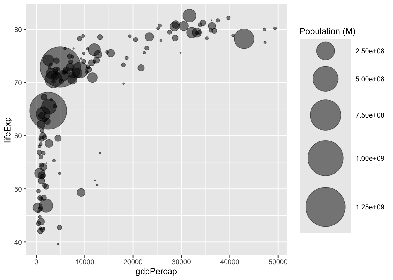
color增加第四个维度:颜色(color)
data |>
  arrange(desc(pop)) |>     # 按人口数量降序排列
  mutate(country = factor(country, country)) |>  # 将国家名转换为因子
  ggplot(aes(x=gdpPercap, y=lifeExp, size=pop, color=continent)) +  # 添加颜色美学映射
    geom_point(alpha=0.5) +   # 设置点的透明度
    scale_size(range = c(.1, 24), name="Population (M)")  # 调整气泡大小范围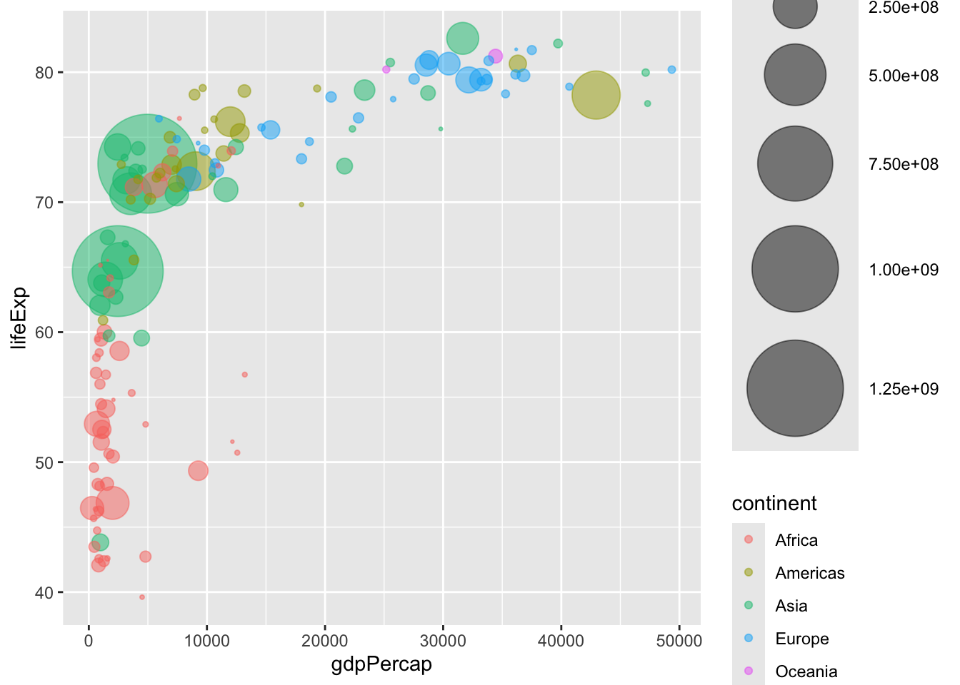
# library(ggplot2)
# library(dplyr)
# library(hrbrthemes)
# library(viridis)

data |>
  arrange(desc(pop)) |>                                        # 按人口数量降序排列
  mutate(country = factor(country, country)) |>                # 将国家名转换为因子
  ggplot(aes(x = gdpPercap, y = lifeExp, size = pop, fill = continent)) +  # 使用fill而不是color
  geom_point(alpha = 0.5, shape = 21, color = "black") +       # 设置点的形状和边框颜色
  scale_size(range = c(.1, 24), name = "Population (M)") +     # 调整气泡大小范围
  scale_fill_viridis(discrete = TRUE, guide = FALSE, option = "A") +  # 使用viridis配色方案
  theme_ipsum() +                                               # 应用ipsum主题
  theme(legend.position = "bottom") +                          # 图例位置
  ylab("Life Expectancy") +                                    # y轴标签
  xlab("Gdp per Capita") +                                     # x轴标签
  theme(legend.position = "none")                              # 隐藏图例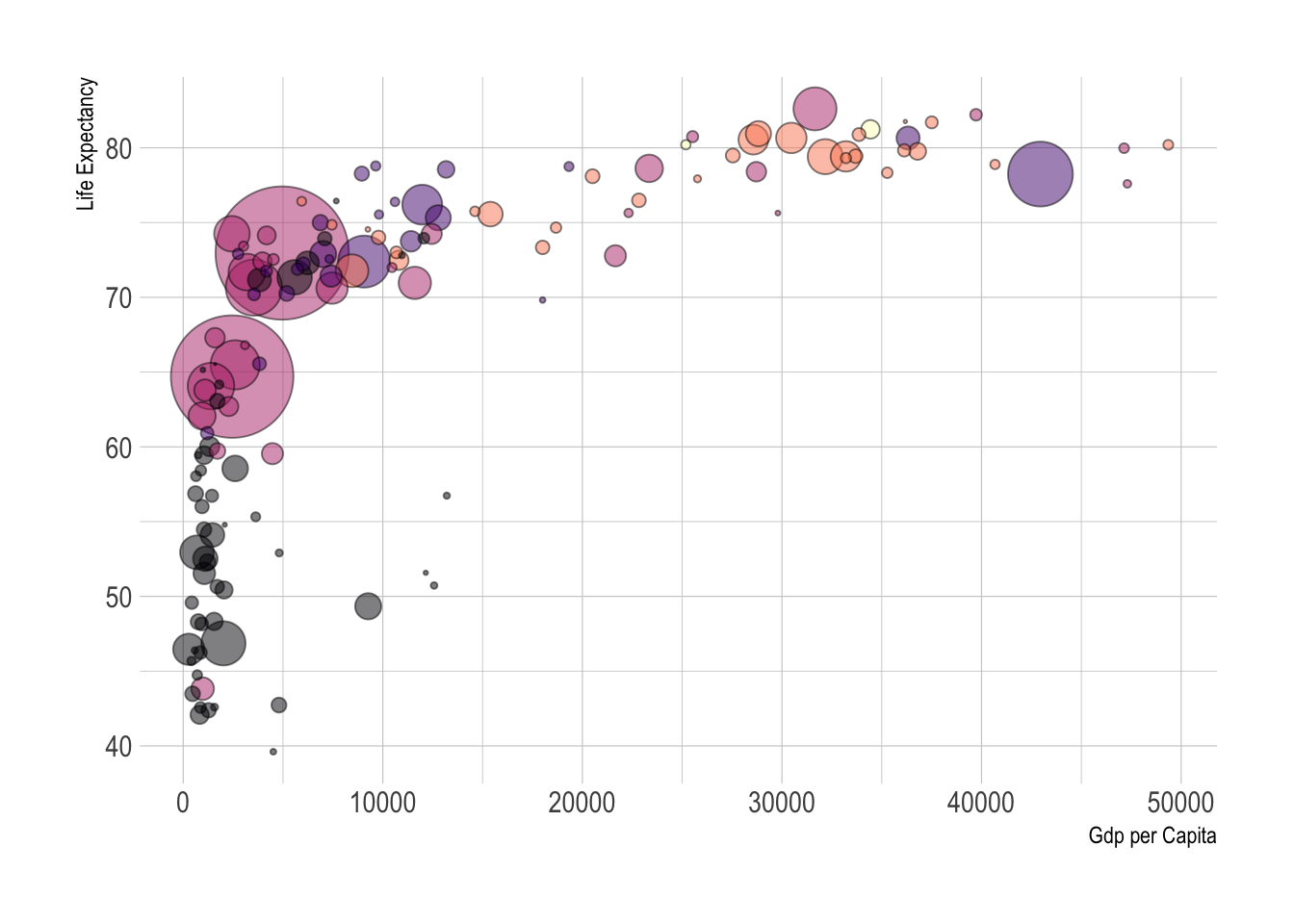
# library(ggplot2)
# library(dplyr)
# library(plotly)
# library(viridis)
# library(hrbrthemes)

# 从gapminder包中获取数据集
library(gapminder)
data <- gapminder |> filter(year == "2007") |> dplyr::select(-year)

# 创建交互式版本
p <- data |>
  mutate(gdpPercap = round(gdpPercap, 0)) |>     # 四舍五入人均GDP
  mutate(pop = round(pop / 1000000, 2)) |>       # 转换人口为百万单位并四舍五入
  mutate(lifeExp = round(lifeExp, 1)) |>         # 四舍五入预期寿命

  # 重新排序国家,让大气泡在上面
  arrange(desc(pop)) |>
  mutate(country = factor(country, country)) |>

  # 为工具提示准备文本
  mutate(
    text = paste(
      "Country: ",
      country,
      "\nPopulation (M): ",
      pop,
      "\nLife Expectancy: ",
      lifeExp,
      "\nGdp per capita: ",
      gdpPercap,
      sep = ""
    )
  ) |>

  # 经典的ggplot绘图
  ggplot(aes(
    x = gdpPercap,
    y = lifeExp,
    size = pop,
    color = continent,
    text = text
  )) +
  geom_point(alpha = 0.7) +                                  # 设置点的透明度
  scale_size(range = c(1.4, 19), name = "Population (M)") + # 调整气泡大小范围
  scale_color_viridis(discrete = TRUE, guide = FALSE) +     # 使用viridis配色方案
  theme_ipsum() +                                            # 应用ipsum主题
  theme(legend.position = "none")                           # 隐藏图例

# 转换为交互式图表
ggplotly(p, tooltip = "text")
使用plotly制作交互式气泡图
带有文字标签的散点图,见 Section 7.7。