Show/Hide Code
library(tidyverse)与饼图相比,环形图在视觉上更具吸引力,但是也存在饼图的问题,见 Chapter 22
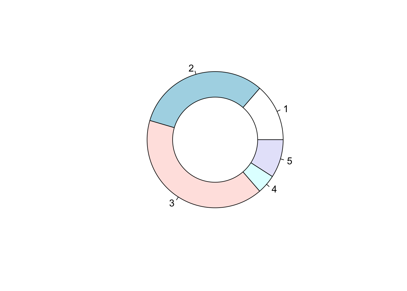
library(tidyverse)Base R先用 pie() 绘制一个饼图,再用Base R::symbols() 叠加略小白色圆形来形成环形效果。
# 定义各部分的比例
Prop <- c(3, 7, 9, 1, 2)

# 绘制饼图
pie(Prop)

# 在饼图中央添加一个白色圆形,形成环形图效果
symbols(
    0,                # x坐标
    0,                # y坐标
    circles = 0.5,    # 圆的半径
    inches = FALSE,   # 使用坐标单位而非英寸
    add = TRUE,       # 在已有图形上添加
    bg = "white",     # 圆的填充色为白色
    fg = "black"      # 圆的边框色为黑色
)
更为复杂的 自定义函数 方法,不推荐
geom_bar()核心思路:
geom_bar() 绘制堆叠条形图coord_polar() 堆叠的矩形切换到环形xlim() 从饼图切换到环形图 (中间添加一个空白圆圈)ggplot(diamonds, aes(x = 2, fill = cut)) +
geom_bar(color = "white") + # 绘制每个cut的条形,白色边框
xlim(0.5, 2.5) + # 设置x轴范围,决定中间空白洞的大小
coord_polar(theta = "y") + # 使用极坐标,将条形图转换为圆环(甜甜圈)
scale_fill_brewer(palette = 2) + # 设置配色方案
theme_void() # 移除所有背景和坐标轴,突出图形主体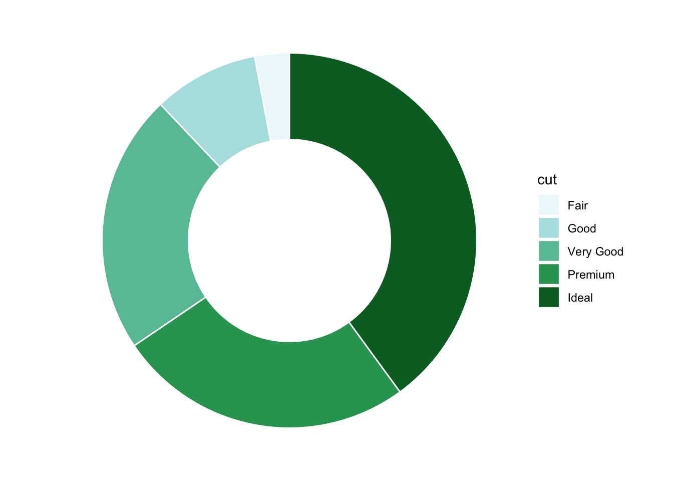
# 修改label来更改文本
# 修改aes(label = label, x = 3) 的 X 来控制标签位置

# 计算每个cut的数量和比例
diamonds_summary <- diamonds |>
  count(cut) |>
  mutate(
    prop = n / sum(n), # 计算每个cut的比例
    percentage = round(prop * 100, 1), # 转换为百分比并保留一位小数
    label = paste0(cut, ": \n", n, " (", percentage, "%)") # 组合标签文本
  )

# 绘制带标签的环形图
ggplot(diamonds_summary, aes(x = 2, y = n, fill = cut)) +
  geom_bar(
    stat = "identity", # 使用实际的y值(n)绘制条形
    color = "white", # 条形之间的分隔线为白色
    width = 1 # 条形宽度
  ) +
  xlim(0.5, 3) + # 控制中间空白圆圈的大小
  geom_text(
    aes(label = label, x = 3), # 设置标签内容
    position = position_stack(vjust = 0.5), # 标签居中显示在每个扇区
    color = "black", # 标签颜色
    size = 3.5, # 标签字体大小
    fontface = "bold" # 标签字体加粗
  ) +
  coord_polar(theta = "y") + # 极坐标转换为环形图
  scale_fill_brewer(palette = 2) + # 设置配色方案
  theme_void() + # 移除背景和坐标轴
  theme(legend.position = "none") # 隐藏图例,标签已包含信息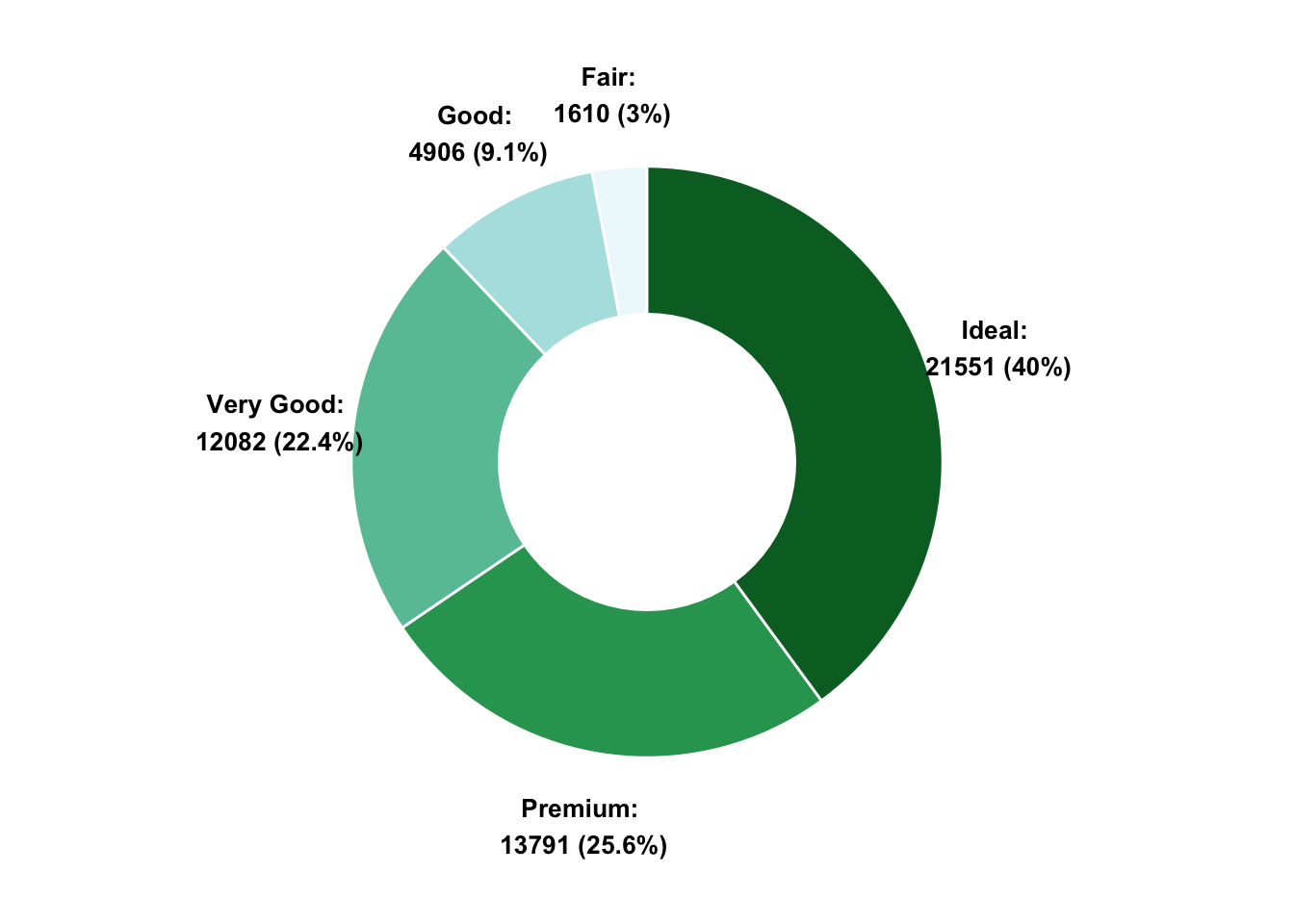
xlim() 函数可以控制环形的厚度, 通过调整 xlim() 的范围来实现。
看不懂就直接删除coord_polar(),就能看到环形的厚度变化。