Show/Hide Code
library(tidyverse)
library(patchwork)      # 用于组合多个图形
library(hexbin)         # 用于六边形分箱
library(RColorBrewer) # 用于调色板用来显示两个数值变量之间的关系, 把数值分箱后计算观测数量, 有不同类型的形状:
library(tidyverse)
library(patchwork) # 用于组合多个图形
library(hexbin) # 用于六边形分箱
library(RColorBrewer) # 用于调色板点太多的时候难以看清信息,黑乎乎一片(或许加上透明度能好一点):
# 生成三组二维正态分布的数据,每组20000个点,3个群体
a <- data.frame(x = rnorm(20000, 10, 1.9), y = rnorm(20000, 10, 1.2))    # 第一组,均值为10
b <- data.frame(x = rnorm(20000, 14.5, 1.9), y = rnorm(20000, 14.5, 1.9)) # 第二组,均值为14.5
c <- data.frame(x = rnorm(20000, 9.5, 1.9), y = rnorm(20000, 15.5, 1.9))  # 第三组,x均值9.5,y均值15.5

# 合并三组数据
data <- rbind(a, b, c)

# 绘制基础散点图,展示所有数据点的分布情况
ggplot(data, aes(x = x, y = y)) +
    geom_point()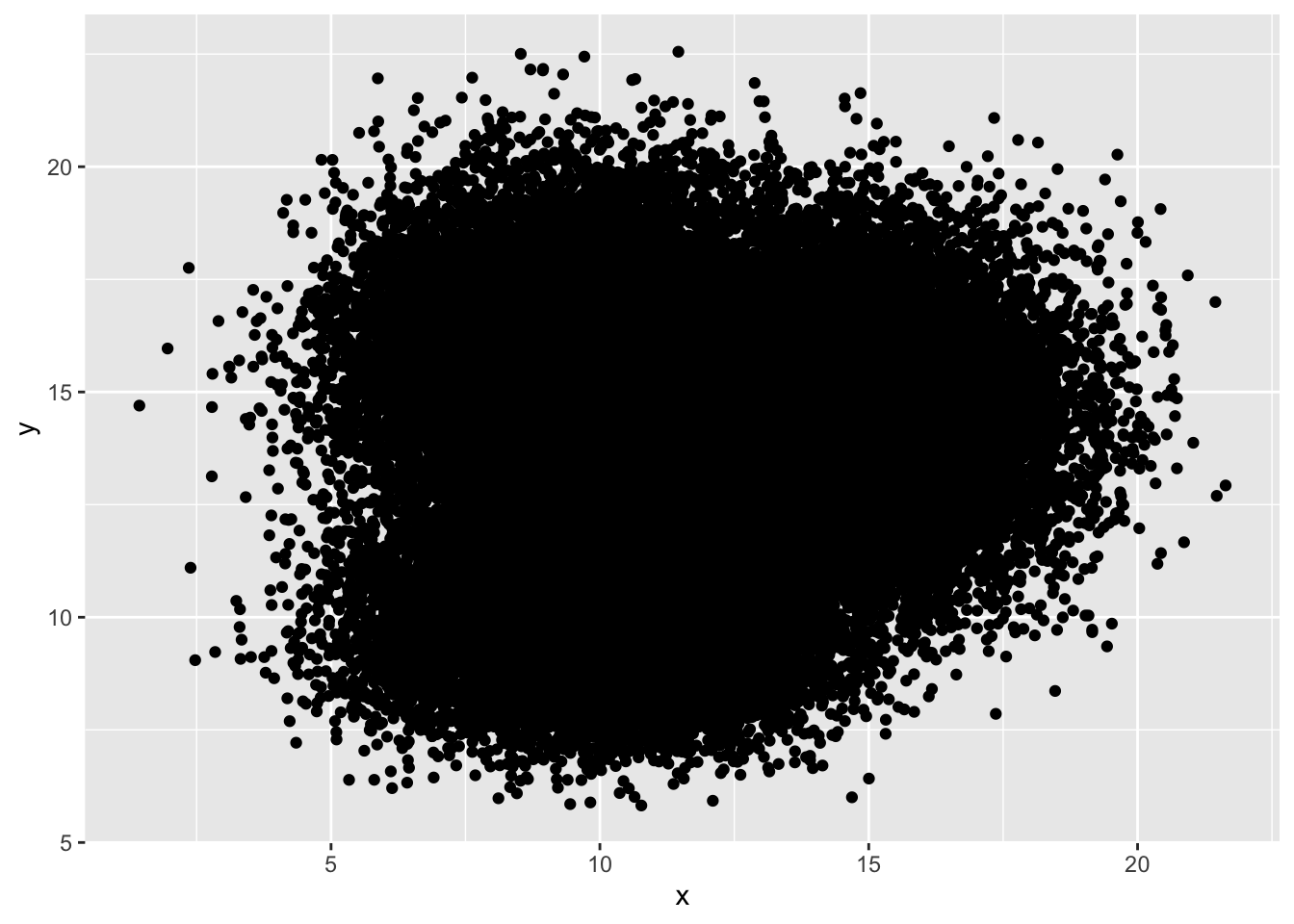
geom_bin2d()ggplot2::geom_bin2d() 是一个用于绘制二维直方图的函数, 它将数据分成网格, 并计算每个网格中的点数, 通过颜色深浅来表示点的分布.
ggplot(data, aes(x = x, y = y)) +
  geom_bin2d() +
  ggtitle("geom_bin2d() with default") +
  theme_bw()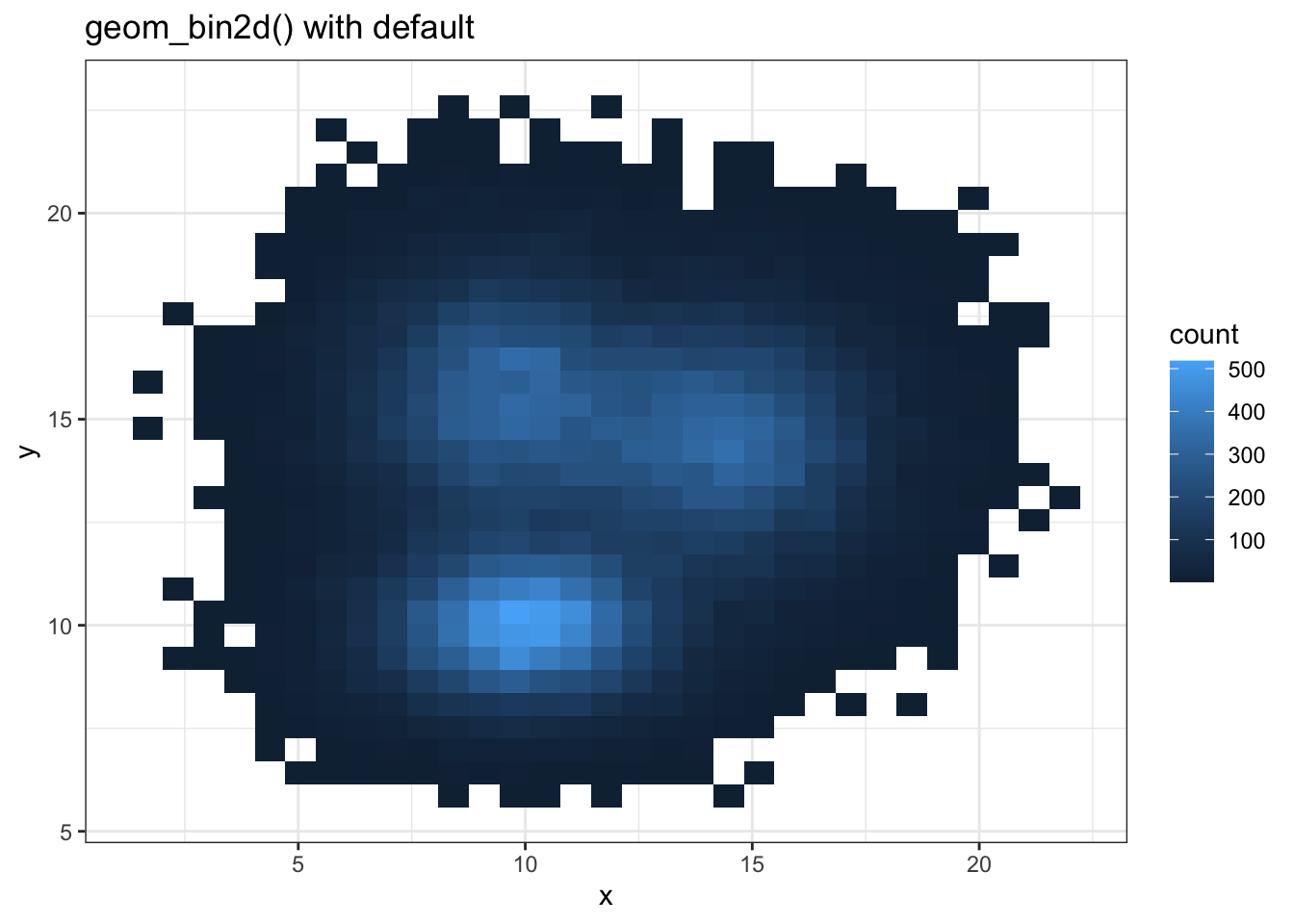
binsggplot(data, aes(x = x, y = y)) +
geom_bin2d(bins = 70) +
scale_fill_continuous(type = "viridis") + # 使用viridis色彩映射
ggtitle("geom_bin2d() with bins = 70") +
theme_bw()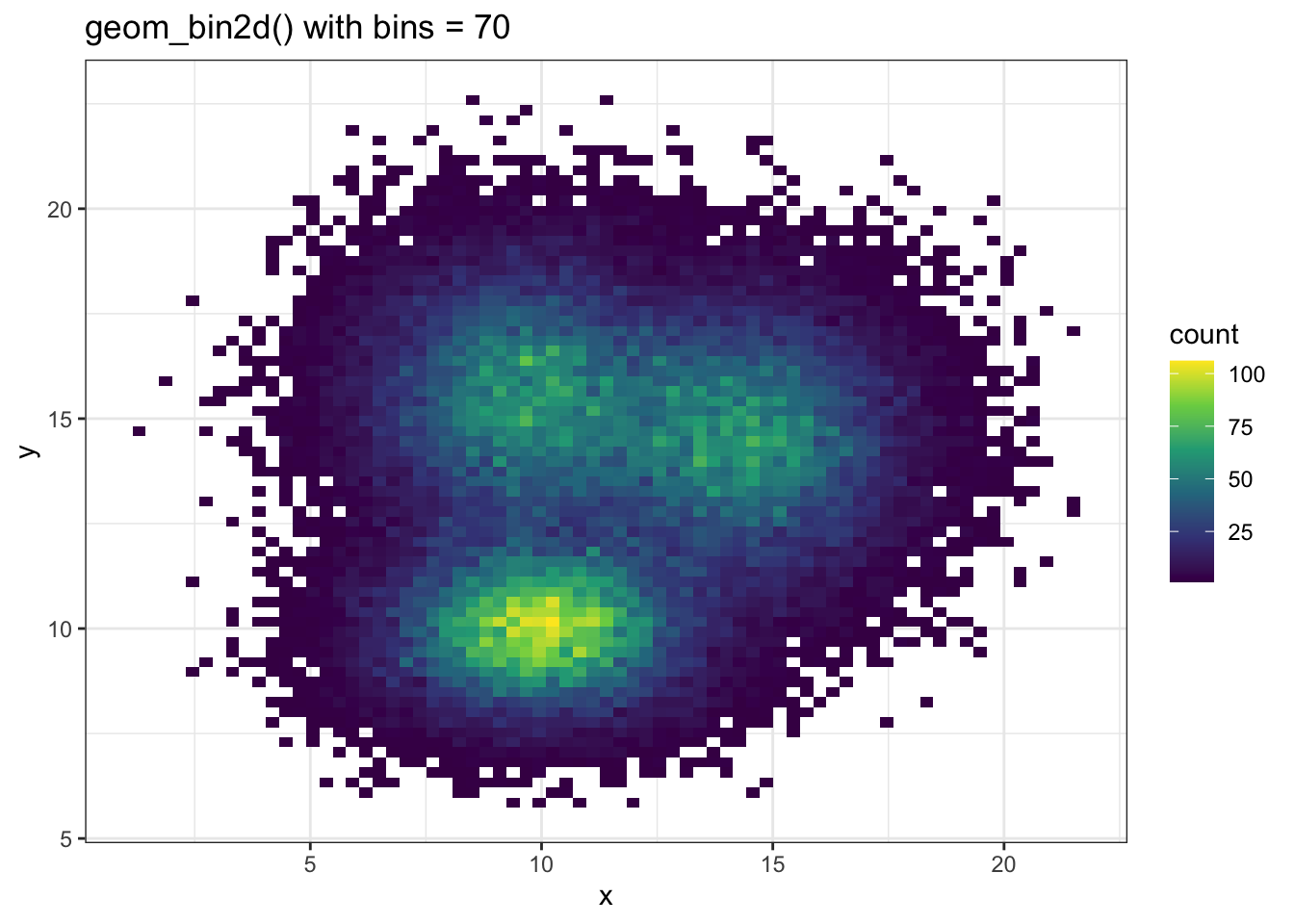
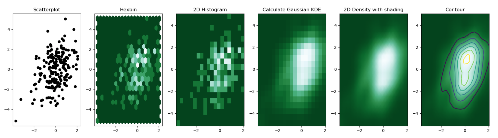
散点图可以叠加在 2D 密度图之上:
# 生成示例数据,x和y分别为1到100的序列加上正态噪声
sample_data <- data.frame(
    x_values = 1:100 + rnorm(100, sd = 20),  # x轴数据,添加标准差为20的正态噪声
    y_values = 1:100 + rnorm(100, sd = 27)   # y轴数据,添加标准差为27的正态噪声
)

# 绘图
ggplot(sample_data, aes(x_values, y_values)) +
    # 绘制二维密度的栅格图,fill映射到密度值,不显示等高线
    stat_density_2d(
        geom = "tile",
        aes(fill = ..density..),
        contour = FALSE
    ) +
    # 叠加白色散点图,突出每个观测点
    geom_point(colour = "white")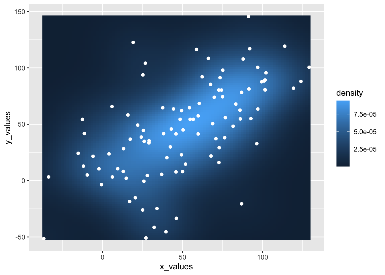
geom_hex()# 使用默认geom_hex()绘制二维密度图
ggplot(data, aes(x = x, y = y)) +
geom_hex() +
ggtitle("geom_hex() with default") +
theme_bw()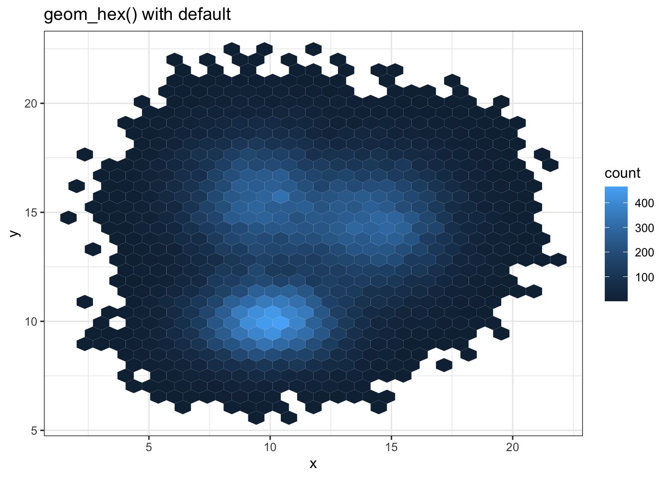
ggplot(data, aes(x = x, y = y)) +
  geom_hex(bins = 70) +
  scale_fill_continuous(type = "viridis") + # 使用viridis色彩映射
  ggtitle("geom_hex() with bins = 70") +
theme_bw() 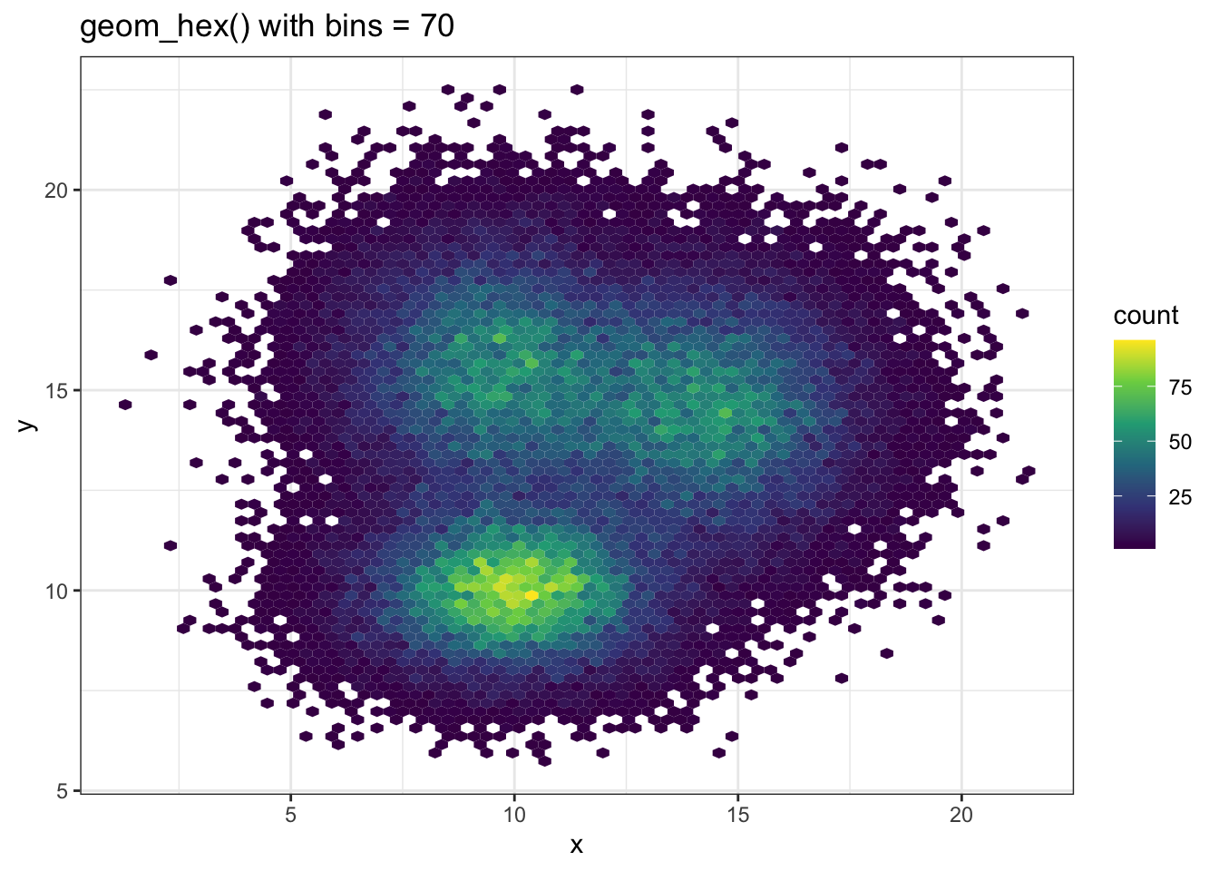
geom_density_2d()stat_density_2d() 与 stat_density_2d() 可以绘制二维密度图
# 仅显示二维密度的等高线
p1 <- ggplot(data, aes(x = x, y = y)) +
    geom_density_2d()

# 仅显示密度区域
p2 <- ggplot(data, aes(x = x, y = y)) +
    stat_density_2d(aes(fill = ..level..), geom = "polygon")

# 同时显示密度区域和等高线
p3 <- ggplot(data, aes(x = x, y = y)) +
    stat_density_2d(aes(fill = ..level..), geom = "polygon", colour = "white")

# 使用raster方式显示密度
p4 <- ggplot(data, aes(x = x, y = y)) +
    stat_density_2d(
        aes(fill = ..density..), # 填充颜色映射到密度值
        geom = "raster",         # 使用栅格图层
        contour = FALSE          # 不显示等高线
    ) +
    scale_x_continuous(expand = c(0, 0)) + # 去除x轴边距
    scale_y_continuous(expand = c(0, 0)) + # 去除y轴边距
    theme(legend.position = 'none')        # 不显示图例

p1 + p2 + p3 + p4 + plot_layout(ncol = 2) 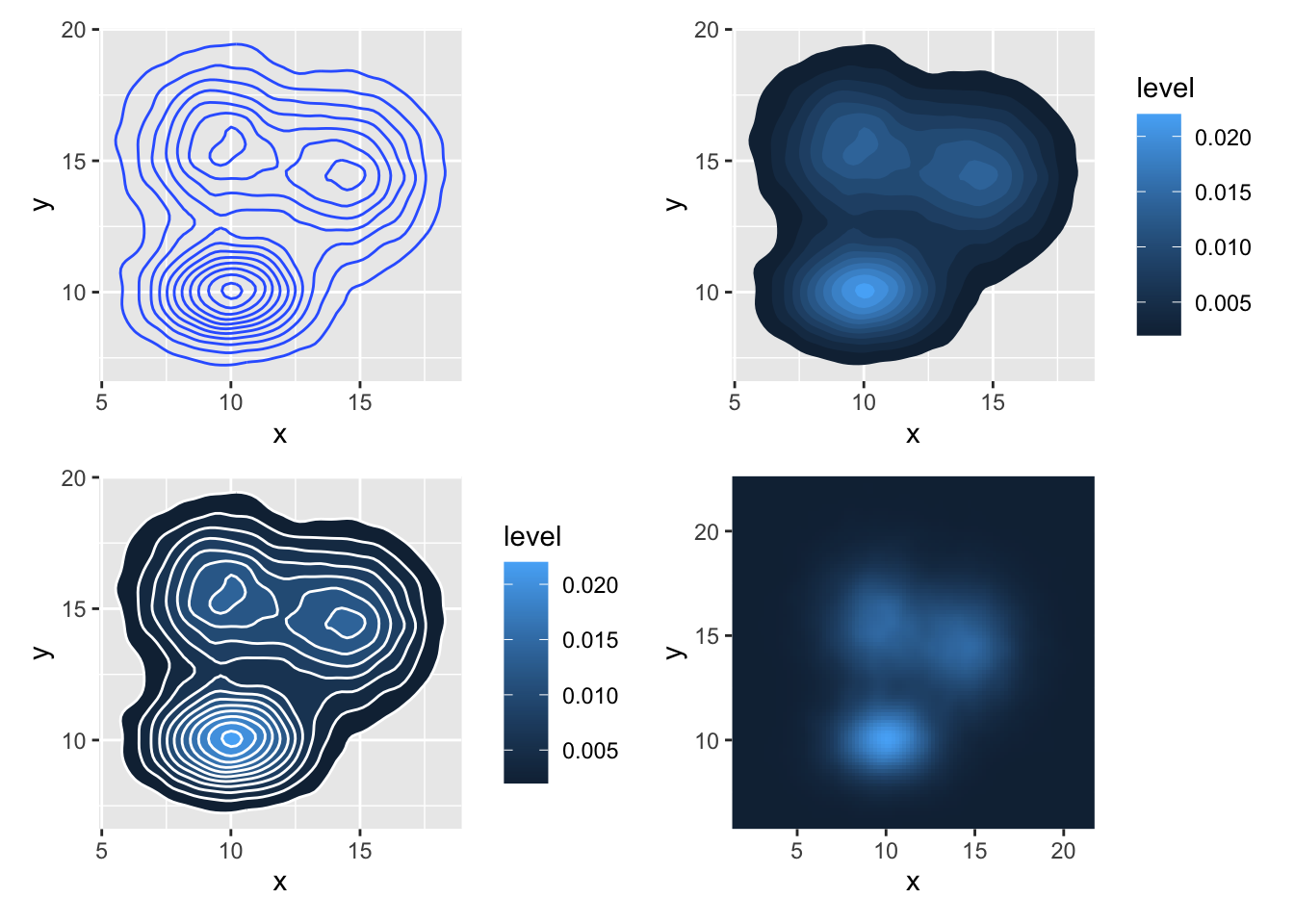
# 使用数字索引选择调色板, direction = -1 反转调色方向
ggplot(data, aes(x = x, y = y)) +
    stat_density_2d(aes(fill = ..density..), geom = "raster", contour = FALSE) + # 绘制二维密度的栅格图
    scale_fill_distiller(palette = 4, direction = -1) + # palette=4表示第4个内置调色板, direction=-1表示反转色阶
    scale_x_continuous(expand = c(0, 0)) + # 去除x轴边距
    scale_y_continuous(expand = c(0, 0)) + # 去除y轴边距
    theme(legend.position = 'none')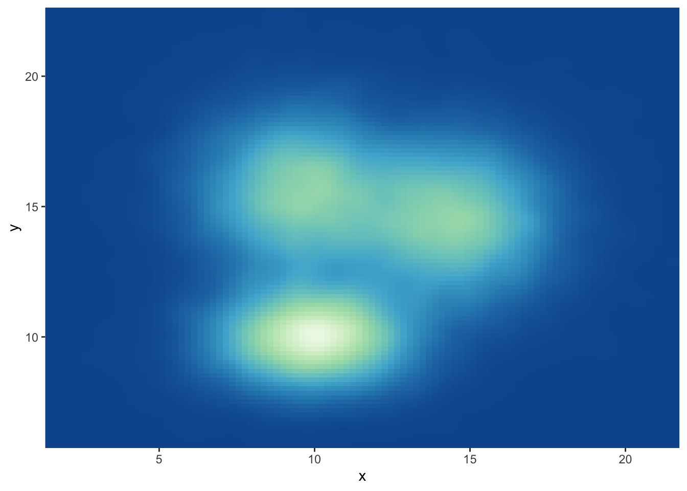
# 使用数字索引选择调色板, direction = 1 保持默认方向
ggplot(data, aes(x = x, y = y)) +
    stat_density_2d(aes(fill = ..density..), geom = "raster", contour = FALSE) +
    scale_fill_distiller(palette = 4, direction = 1) + # direction=1为默认方向
    scale_x_continuous(expand = c(0, 0)) +
    scale_y_continuous(expand = c(0, 0)) +
    theme(legend.position = 'none')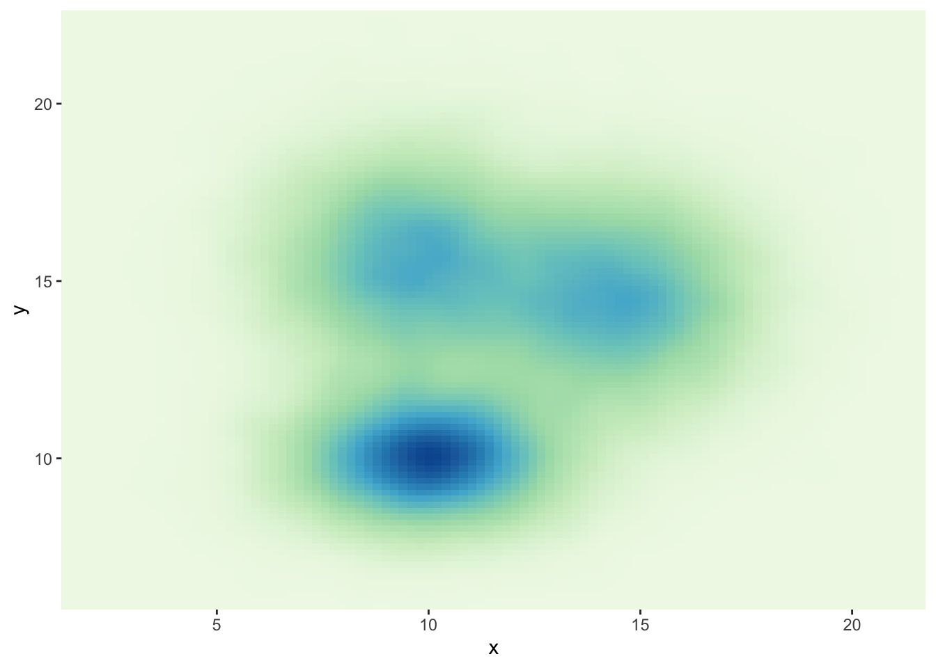
# 使用调色板名称调用,如"Spectral"
ggplot(data, aes(x = x, y = y)) +
    stat_density_2d(aes(fill = ..density..), geom = "raster", contour = FALSE) +
    scale_fill_distiller(palette = "Spectral", direction = 1) + # palette参数直接指定调色板名称
    scale_x_continuous(expand = c(0, 0)) +
    scale_y_continuous(expand = c(0, 0)) +
    theme(legend.position = 'none')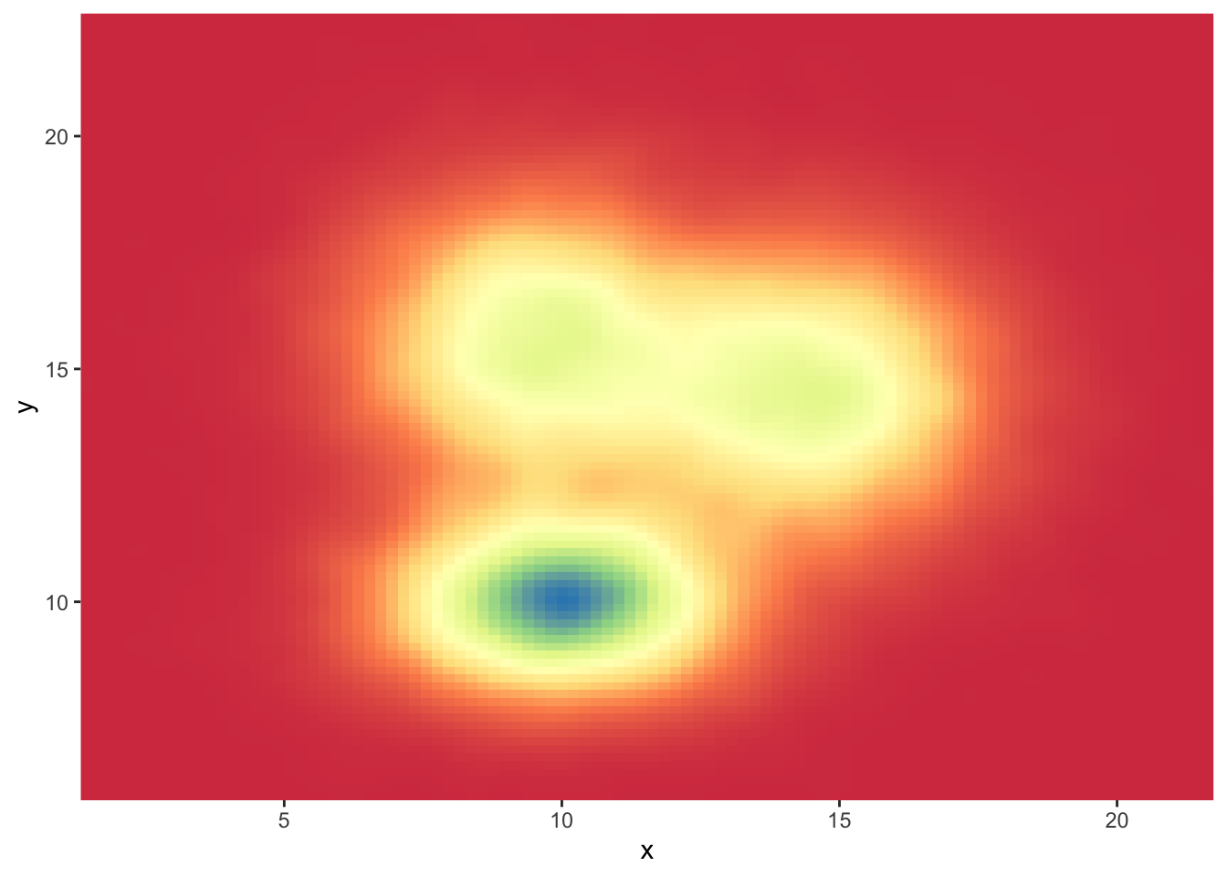
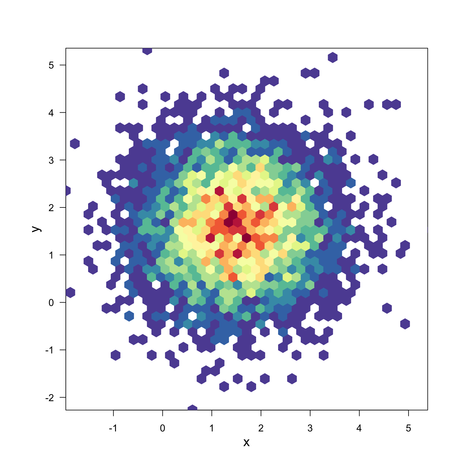
hexbin使用 hexbin 和 RColorBrewer 绘制基础六边形二维密度图:
# library(hexbin)         # 用于六边形分箱
# library(RColorBrewer)   # 用于调色板

# 生成数据:x和y分别为正态分布,均值分别为1.5和1.6,共5000个点
x <- rnorm(mean = 1.5, 5000)
y <- rnorm(mean = 1.6, 5000)

# 进行六边形分箱,xbins控制六边形的数量
bin <- hexbin(x, y, xbins = 40)

# 生成颜色映射,使用Spectral调色板并反转
my_colors = colorRampPalette(rev(brewer.pal(11, 'Spectral')))

# 绘制六边形二维密度图,不显示主标题和图例
plot(bin, main = "", colramp = my_colors, legend = FALSE)